21 Peel and Stick Wallpaper Ideas That Donโ€™t Look Like Peel and Stick

21 Peel and Stick Wallpaper Ideas for Renters That Look Real

Peel and stick wallpaper has come a long way from the shiny patterns and obvious repeats that can make a rental wall look temporary. The right print, scale, color palette, and placement can make it feel much closer to a thoughtful wall finish than a quick decorating fix.

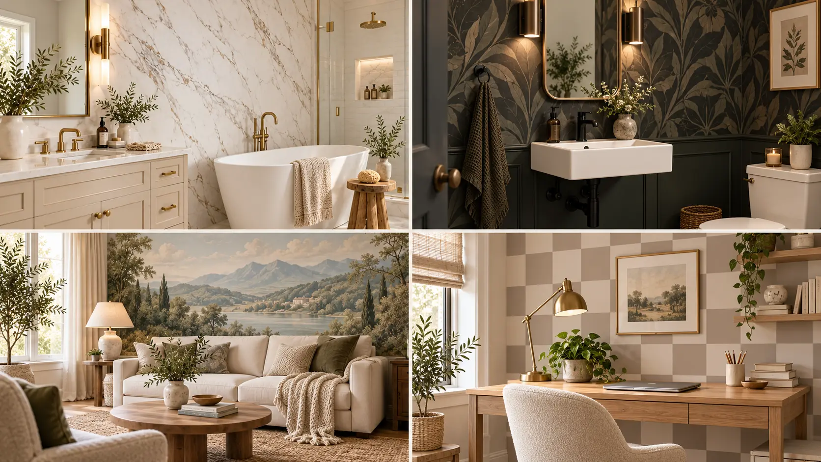
These peel-and-stick wallpaper ideas for renters focus on designs that look considered once they are part of the room. Think soft linen textures behind a bed, oversized murals that replace a wall full of art, quiet plaster effects, bold powder room patterns, framed wallpaper panels, and warm block prints that work with the furniture you already own.

The key is not covering every wall. Often, one carefully chosen surface creates a stronger result. Pattern size, surrounding furniture, lighting, and even where the wallpaper stops can change how convincing it looks.

Use these ideas as inspiration for creating a rental that feels personal now, while keeping your decorating choices flexible for the future.

1. Fake the Look of Full Slab Marble
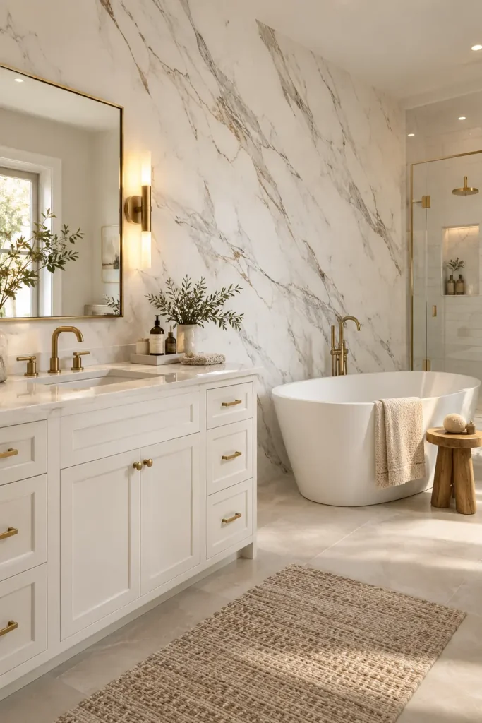
Large-scale stone patterns can make peel-and-stick wallpaper feel much more expensive than small repeating prints. The trick is choosing a design with long, loose veining instead of lots of tiny gray marks.

For a bathroom or vanity wall, keep the rest of the room quiet:

  • warm white surfaces
  • simple metal finishes
  • very little wall clutter

Use the wallpaper on one uninterrupted wall whenever possible. Too many corners and cutouts can expose seams and make the finish feel temporary.

The strongest version of this idea is calm, oversized, and simple.

๐Ÿ’ก Make It Look More Real

Choose wide stone veining and fewer obvious repeats. A busy marble print can quickly reveal that the surface is wallpaper.

2. Use a Dark Organic Print in a Small Zone
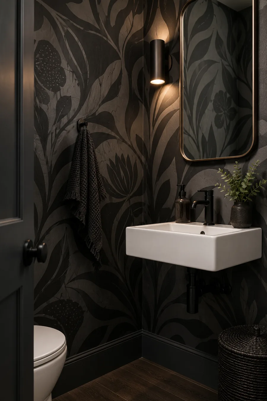
Dark wallpaper does not have to cover a whole room. A compact wall, nook, powder room, or narrow passage can handle a bold organic pattern surprisingly well.

Start with a design that has:

  1. a deep background
  2. large flowing shapes
  3. only a few colors

Then let the wallpaper do most of the work. Too many frames, signs, and accessories can make a strong pattern feel crowded.

A small area is also easier for renters because there are fewer panels to align and less material to remove later.

The result feels intentional because the print has a clear boundary instead of slowly taking over the room.

Build the look

โœ…Pick one compact feature wall.
โœ…Use a large-scale organic pattern.
โœ…Keep nearby decor restrained so the pattern stays clear.

3. Make an Entryway Feel Custom With an Abstract Neutral Pattern
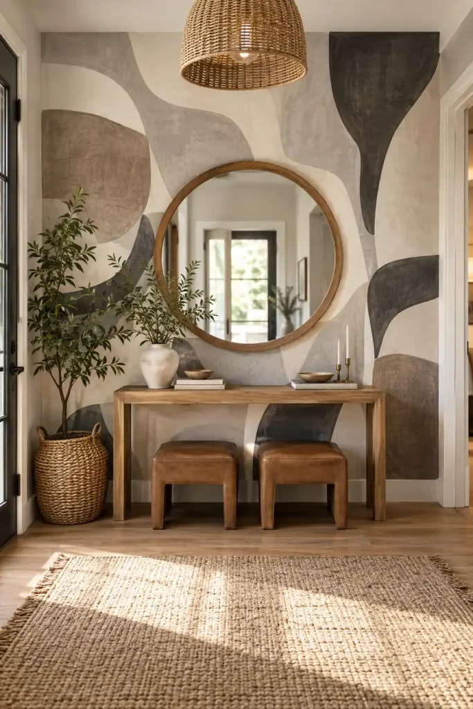
An entryway is a smart place for peel-and-stick wallpaper because even a small amount can give the space a clear identity.

Instead of a tiny repeated motif, look for large abstract shapes in earthy neutrals. Cream, charcoal, taupe, clay, and muted brown tend to work well with wood furniture and simple mirrors.

Keep the furniture narrower than the wallpapered section so the pattern still shows around it. A console, round mirror, plant, and low stools or baskets are enough to make the area feel finished.

Avoid matching every accessory to the wallpaper. A few natural materials keep the room from looking too coordinated.

โœ… Keep

Large abstract forms.

Warm wood and simple shapes.

๐Ÿšซ Avoid

Too many tiny accessories.

Furniture that hides most of the pattern.

4. Try a Crisp Geometric Print Behind Open Kitchen Shelves
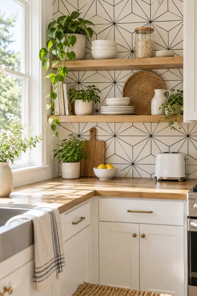
A black-and-white geometric wallpaper can work especially well in a rental kitchen because the pattern reads more like a designed backsplash or wall treatment than a temporary covering.

The cleanest approach is to use it behind open shelving or along one clear section of wall.

Pair it with:

  • warm wood
  • white cabinetry
  • simple ceramics
  • a few green plants

The contrast keeps the wall graphic, while the natural materials stop it from feeling harsh.

Before applying anything near cooking or washing areas, check the wallpaper maker’s instructions for moisture, heat, cleaning, and suitable surfaces.

โ—ผ๏ธ
Pattern
crisp geometric
๐Ÿชต
Pair with
warm wood
๐Ÿ 
Best zone
small kitchen wall

Coverage tracker ab 4 distinct directions cover kar chuka hai: stone look, dark organic pattern, abstract neutral feature wall, aur graphic geometric kitchen treatment.

Tumhara article target 21 ideas hai, isliye ab 17 fresh AI ideas chahiye honge jo in four concepts ko repeat nahi karenge.

continue

5. Choose a Linen Look Behind the Bed
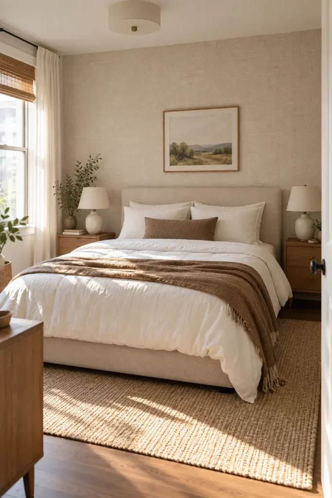
A soft woven pattern can make a bedroom wall feel closer to fabric or textured plaster than printed wallpaper. Keep the color quiet, such as warm oatmeal, soft beige, dusty taupe, or pale mushroom.

The best setup is simple:

  • cover only the wall behind the bed
  • use solid bedding instead of another busy print
  • repeat the wallpaper color in one or two pillows
  • keep bedside lighting warm

Fine texture works best when you can see it up close without noticing an obvious repeating motif.

๐Ÿ’ก Styling Tip

Let the texture be the pattern. Solid bedding and simple lamps keep a linen look from competing with too many other details.

6. Turn One Wall Into a Quiet Landscape Mural
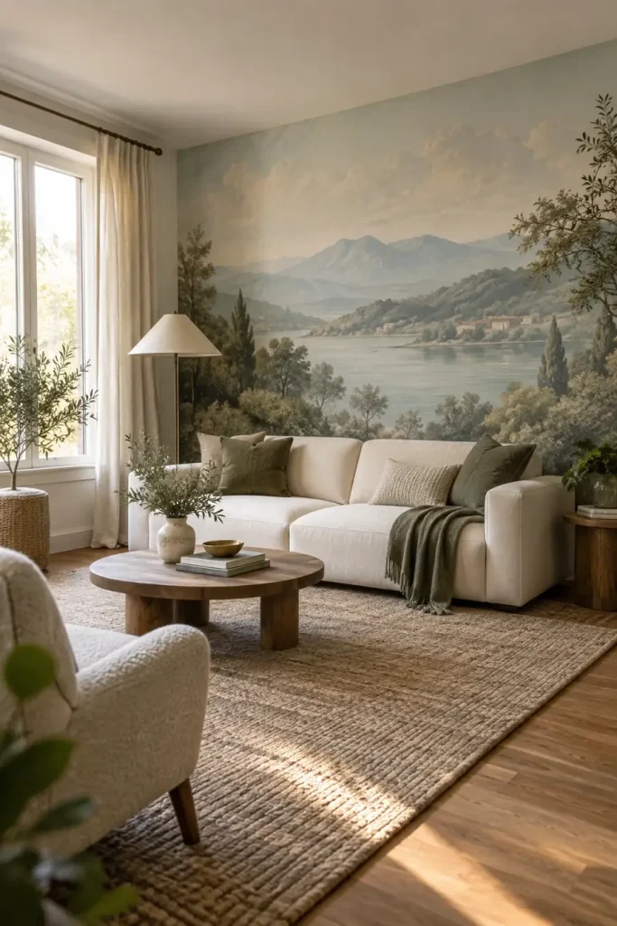
A mural can look surprisingly permanent when it feels more like artwork than wallpaper.

Choose a scene with soft edges and restrained color. Misty hills, faded trees, cloudy skies, or a washed coastal landscape can fill a living room wall without making it feel like a giant printed poster.

Before: a long blank wall that needs several pieces of art.

After: one continuous scene that becomes the room’s main visual feature.

Keep furniture low enough that the most interesting part of the mural stays visible. A plain sofa and a few solid cushions are usually enough around it.

BEFORE

A large blank wall that feels unfinished and needs several decorations.

AFTER โœจ

One soft landscape becomes the focal point while the furniture stays simple.

7. Fake Grasscloth With a Warm Woven Pattern
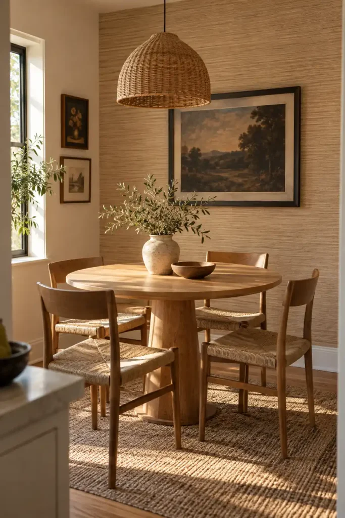
Real grasscloth has slight variation and visible fibers. A peel-and-stick version can borrow that look without trying to imitate every tiny strand.

Start with a warm neutral shade. Then build around it in three steps:

  1. Use the wallpaper on one dining or breakfast nook wall.
  2. Add wood furniture with a visible grain.
  3. Bring in one dark detail, such as black frames or a dark pendant, for contrast.

Avoid a pattern with a shiny finish if you want it to read as woven texture. A softer surface usually feels more believable.

1

Cover one defined wall instead of wrapping every surface.

2

Repeat the warmth with natural wood furniture.

3

Add one darker accent to stop the neutrals from looking flat.

8. Stretch a Narrow Hallway With Fine Vertical Stripes
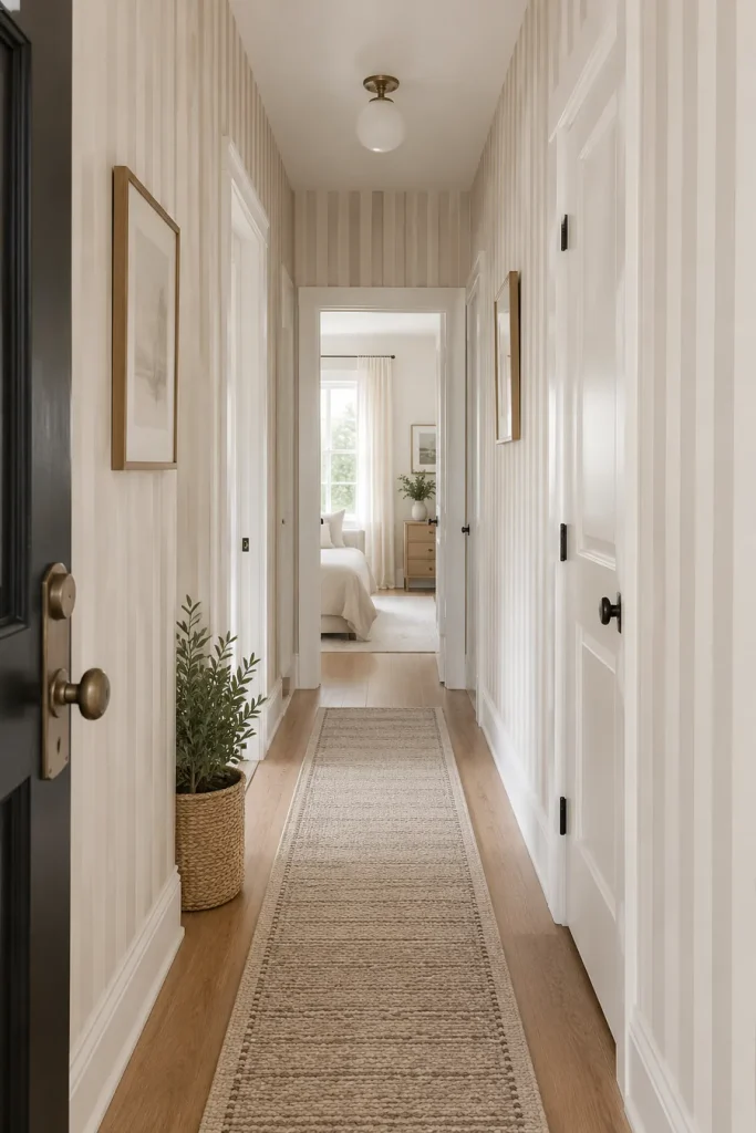
Thin stripes can give a hallway more rhythm without turning it into a statement room.

Use a low-contrast pairing such as cream with taupe, beige with soft brown, or warm white with muted gray. The pattern feels calmer when the lines are narrow and evenly spaced.

A good hallway combination includes:

  • slim vertical stripes
  • simple lighting
  • very little wall art
  • one runner with a quieter pattern

The repeated vertical lines naturally pull the eye upward. That helps a low ceiling feel a little less heavy.

โ†•๏ธ
Direction
vertical
๐ŸŽจ
Contrast
soft
๐Ÿšช
Best Spot
narrow hallway

9. Use a Plaster Look Instead of a Busy Print
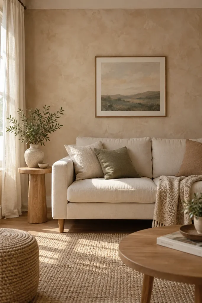
Some of the most convincing peel-and-stick walls do not look patterned at all.

A warm plaster or limewash inspired print adds variation without obvious flowers, grids, or motifs. It can work well for renters who want a little character but still prefer quiet rooms.

Soft plaster lookBusy repeating print
Blends into the roomBecomes the main feature
Easier to pair with artNeeds simpler wall decor
Repeat is less noticeableRepeat may be easier to spot

Look for gentle tonal movement rather than dramatic dark patches.

Soft Plaster LookBusy Print
Feels like a wall finish.Reads clearly as a pattern.
Works easily behind artwork.Usually needs fewer competing details.

10. Give a Home Office a Soft Checkerboard Wall
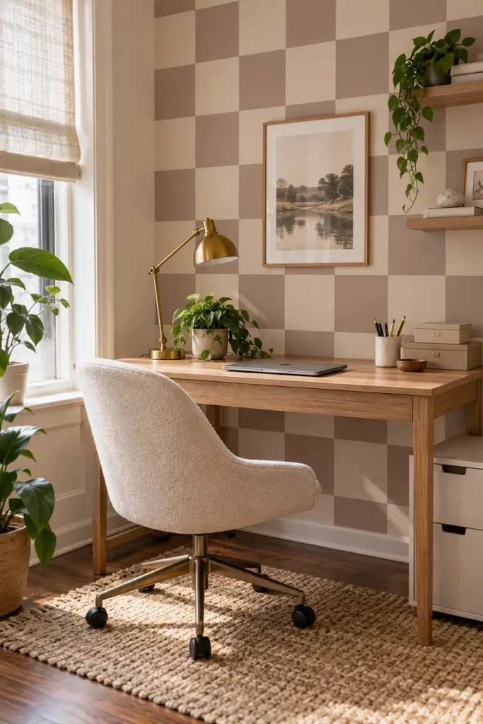
Checkerboard does not have to mean bold black and white squares.

A softer version in dusty brown, faded cream, sage, or muted blue can make a small work area feel designed without looking like a novelty pattern.

Keep the squares fairly large. Tiny checks can feel busy behind a computer screen.

A simple desk, one task lamp, and closed storage help the wall stay interesting without creating visual noise.

WHY THIS WORKS

A familiar pattern in quieter colors feels playful enough for a workspace without overpowering the desk.

11. Try a Tiny Botanical Print in a Powder Room
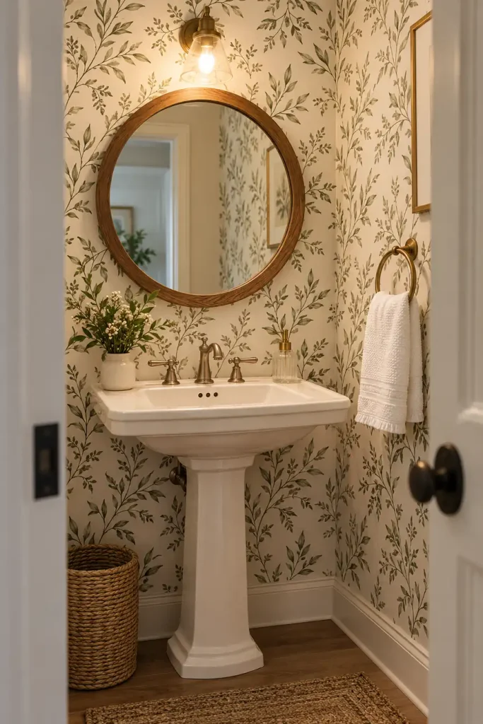
Small rooms can handle patterns that might feel too busy in a living room.

A tiny leaf, sprig, or hand drawn botanical print works especially well when the colors stay limited. Cream with olive, dusty green with white, or soft brown with beige can feel collected rather than themed.

Keep the plumbing fixtures and towels simple.

The wallpaper already brings detail, so extra signs, baskets, wall sayings, and decorative shelves are usually unnecessary.

A small repeat also makes pattern matching less visually dominant across a compact wall.

Keep the room balanced

โœ…Choose two or three wallpaper colors at most.
โœ…Use plain towels and simple accessories.
โœ…Let the small print provide the detail.

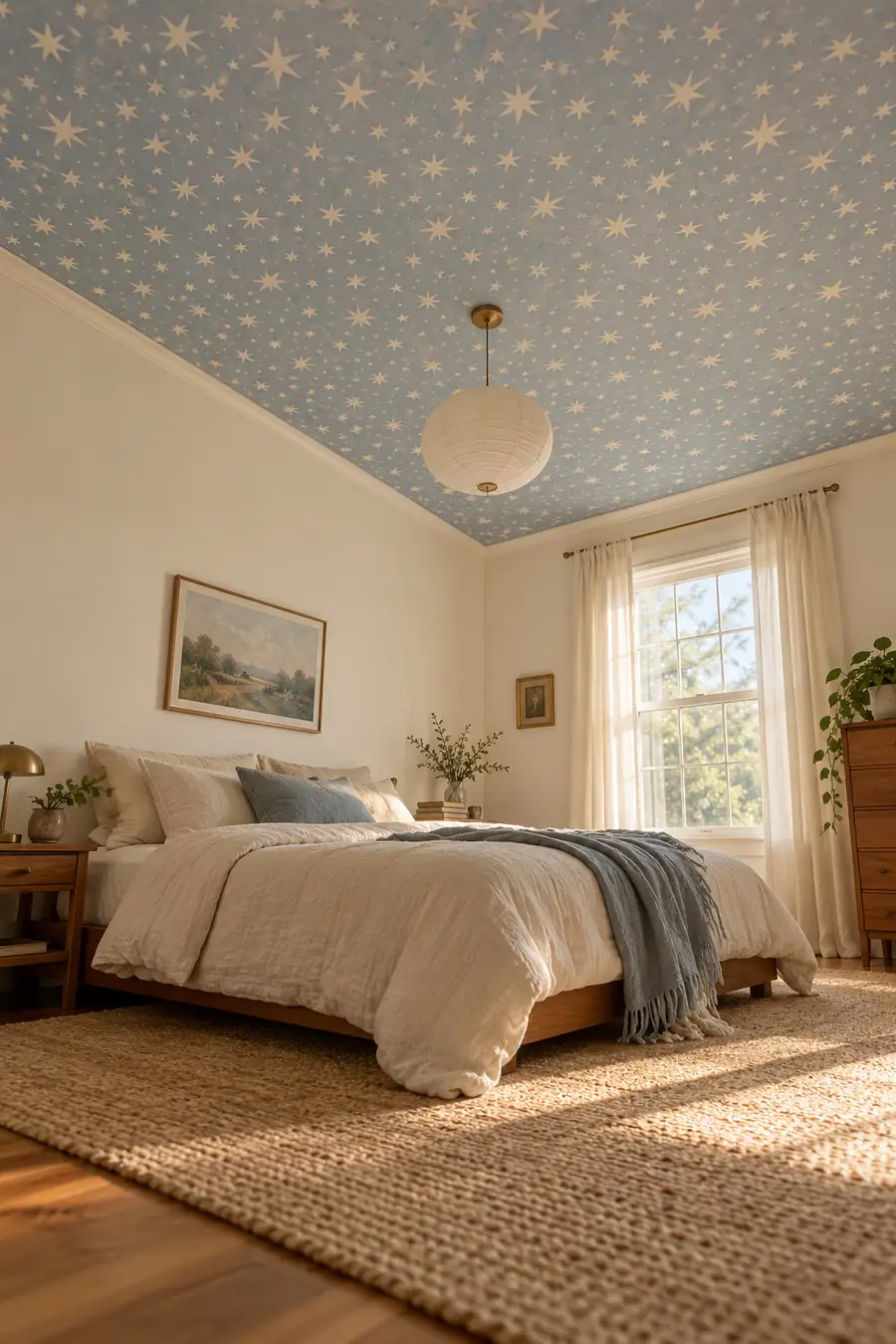
12. Put the Pattern on the Ceiling

The ceiling is an unexpected place for removable wallpaper, which is exactly why the result can feel custom.

A bedroom or small office can handle a subtle ceiling pattern while the walls stay plain. Soft stars, tiny geometric marks, watercolor clouds, or a restrained repeating motif can work without pulling the room downward.

Use a lighter background if the ceiling already feels low.

โœ… Do this

Use a light background.

Keep the walls mostly quiet.

๐Ÿšซ Skip this

Very dark paper on a low ceiling.

Several competing patterns in the same room.

13. Line the Back of a Freestanding Bookcase
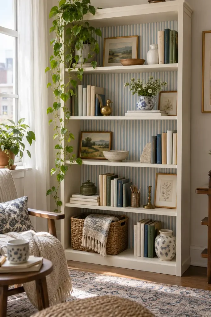
You do not need to cover an entire wall to make wallpaper part of the room.

A peel-and-stick pattern behind the shelves of a freestanding bookcase creates depth and makes ordinary storage feel more intentional. This works best with a restrained print that does not fight with the books and objects in front.

Good choices include:

โ–ธ faded ticking stripes
โ–ธ tiny floral patterns
โ–ธ soft block prints
โ–ธ quiet geometric motifs

Leave a little empty shelf space. If every inch is packed, the wallpaper disappears.

  • โ–ธUse a low contrast pattern behind books.
  • โ–ธKeep some open space so the background can show.
  • โ–ธRepeat one wallpaper color in a nearby accessory.

14. Frame Wallpaper Panels Instead of Covering the Wall
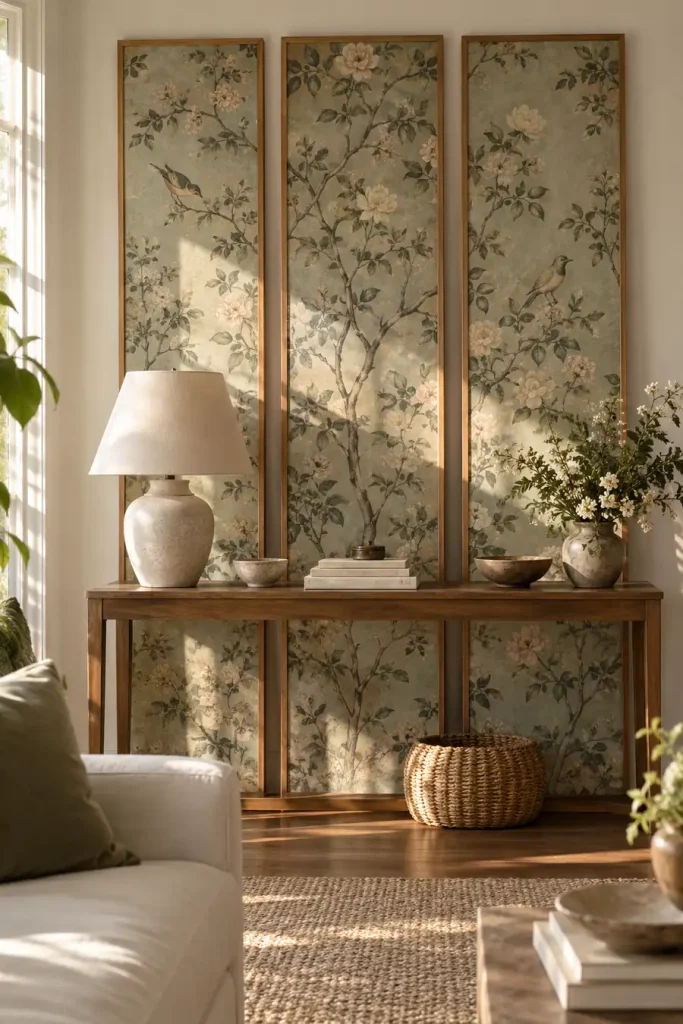
Large framed sections of wallpaper can give you the pattern without committing to a full installation.

Choose two or three matching panels, mount the wallpaper inside lightweight frames or removable display panels, and hang or lean them where appropriate.

This works especially well with scenic, floral, or block printed designs because each panel reads like artwork.

1. Choose

Pick a pattern with enough detail to stand alone.

2. Divide

Split the design into matching vertical sections.

3. Display

Treat the finished panels like oversized art.

15. Make a Half Wall Feel Architectural
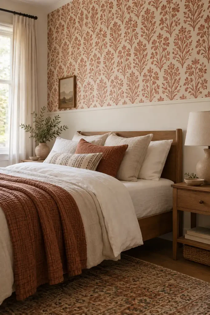
A half wall treatment can look more deliberate than covering the whole room.

Use wallpaper on either the upper or lower section, then create a clean horizontal stopping point. In a rental, that boundary can come from existing trim, a removable molding solution, or simply a carefully measured line.

A quiet stripe, plaid, floral, or block print works well because the smaller area keeps it from becoming overwhelming.

๐Ÿ“Œ Good To Know

The stopping line needs to look intentional. Measure from several points instead of assuming the floor or ceiling is perfectly level.

16. Use Vintage Toile With Modern Furniture
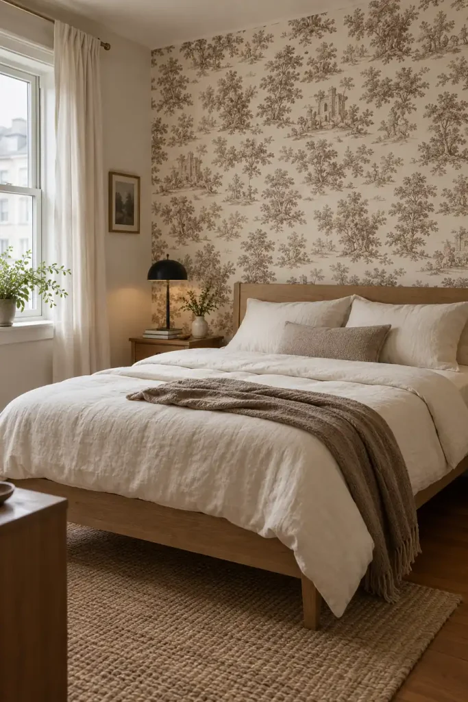
Toile can feel formal, but pairing it with cleaner furniture changes the mood.

Choose a two color print instead of a highly detailed multicolor version. Soft brown and cream, faded blue and white, or muted green and ivory are easier to live with.

Then bring in simple furniture with straight lines.

The contrast is the point: old fashioned pattern, modern shapes.

That mix helps the wallpaper feel collected over time rather than like a temporary decorating trick.

TOO MATCHED

Traditional wallpaper with equally ornate furniture can make the room feel staged.

BETTER MIX โœจ

A classic toile print with simple furniture feels fresher and more believable.

17. Add a Faux Tile Pattern to a Laundry Nook
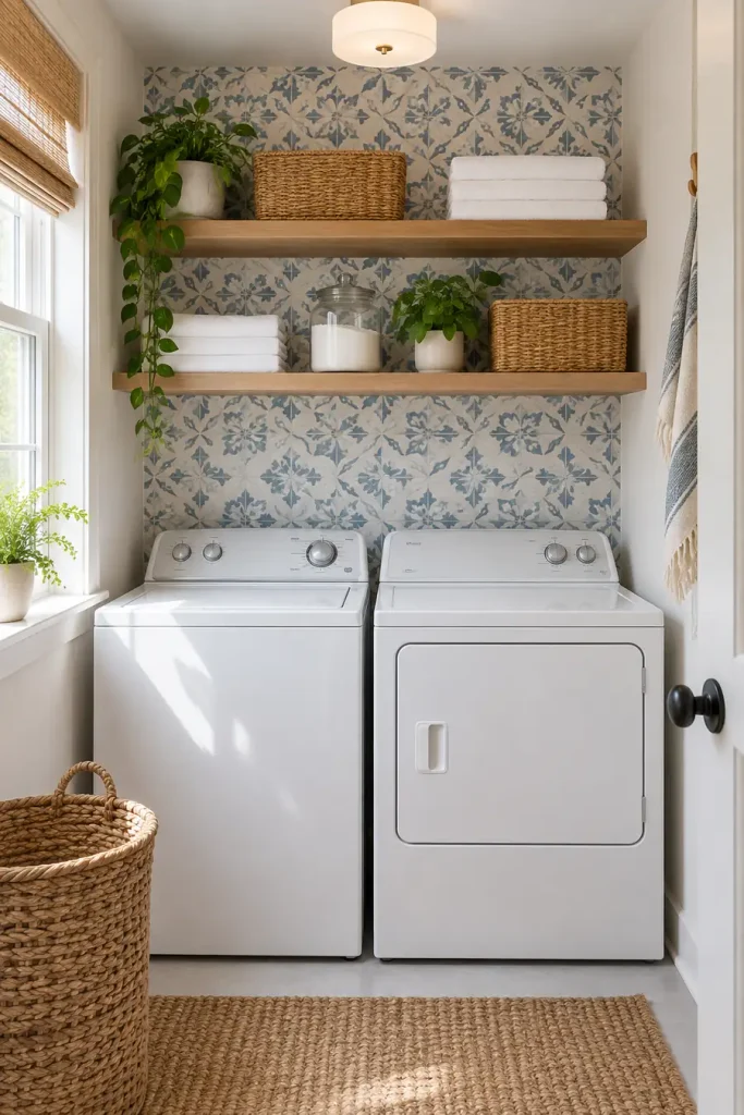
A compact laundry area can take a stronger pattern because you only see a small amount at once.

Look for a tile inspired design with a consistent repeat and restrained colors. Soft blue and white, warm clay and cream, or muted charcoal can bring life to the wall behind machines or open shelving.

Start with a clean visual boundary, such as the edge of cabinetry or the width of the laundry area.

1

Define the exact laundry zone before applying the pattern.

2

Keep baskets and containers mostly plain.

3

Check the product guidance for the surface and room conditions.

18. Use Oversized Arches for a Modern Bedroom Wall
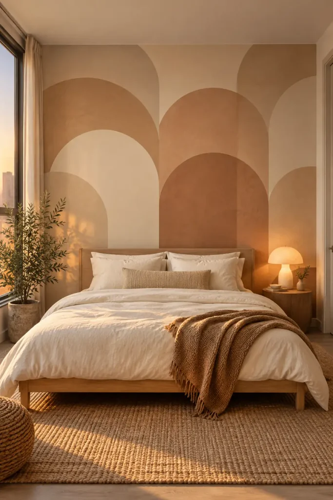
Curved shapes can soften a room filled with square furniture.

Choose a wallpaper with large overlapping arches in close colors such as sand, terracotta, cream, or muted brown. The bigger scale is important. Tiny arches can read as a novelty print, while larger forms feel more like a mural.

Use the wallpaper behind the bed and keep the headboard simple.

ใ€ฐ๏ธ
Shape
large curves
๐ŸŽจ
Palette
close tones
๐Ÿ›๏ธ
Best Use
behind the bed

19. Create an Ombre Wall With Almost No Visible Repeat
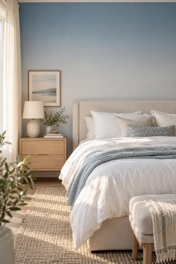
An ombre design is useful when you want color but do not want a pattern to announce itself.

A gentle fade from deeper color near the bottom into a lighter shade above can make the wall feel more like a painted finish.

Good combinations include:

  • clay into cream
  • dusty blue into pale gray
  • sage into warm white

The fewer obvious landmarks in the design, the less attention your eye gives to panel joins.

OmbreDetailed Print
Reads more like a painted effect.Reads clearly as wallpaper.
Pairs easily with artwork.May compete with framed pieces.

20. Use a Muted Plaid in a Reading Corner
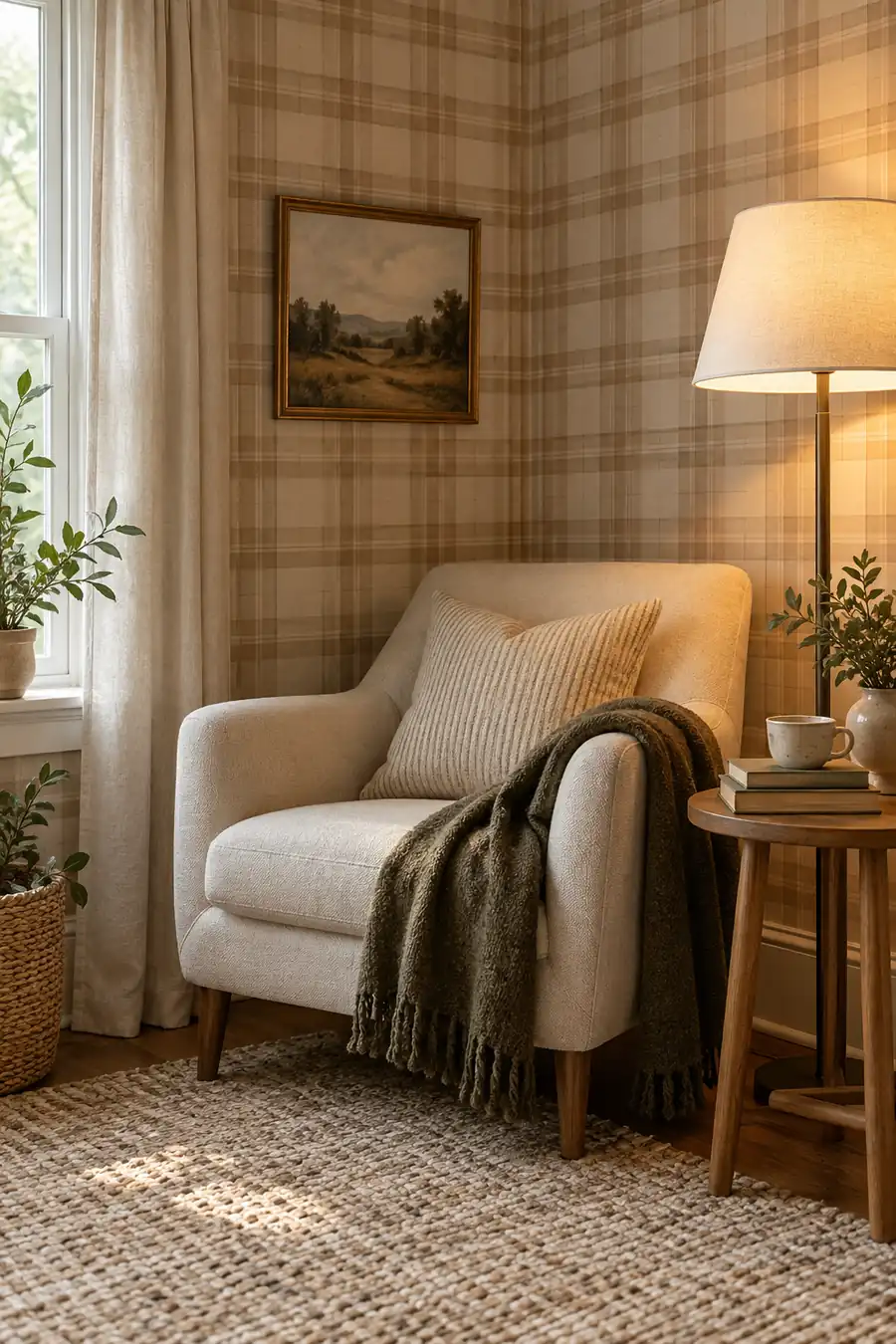
Plaid can feel surprisingly grown up when the colors stay soft.

Instead of a bright tartan, look for a loose grid in camel, cream, faded olive, or dusty brown. Use it in a small reading corner where the pattern can create a sense of enclosure.

A plain chair, one floor lamp, and a small side table are enough.

WHY THIS WORKS

A quiet plaid gives a small corner definition without needing extra shelves, signs, or decorative clutter.

21. Let a Tonal Block Print Carry the Whole Room
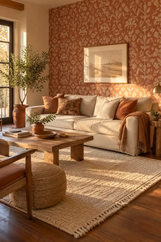
The easiest way to make a patterned wall feel expensive is often to reduce the number of colors.

A hand printed style motif in two close shades, such as rust and clay, navy and faded blue, or olive and sage, has enough variation to feel interesting without shouting across the room.

Use it on one clear wall and repeat one of its colors somewhere else in the room.

That might be a throw blanket, lamp base, pillow, or small rug.

The repetition ties the wallpaper into the room instead of making it look pasted on afterward.

Pull the room together

โœ…Choose a pattern with two closely related colors.
โœ…Repeat one wallpaper shade in a textile or accessory.
โœ…Leave the remaining surfaces simpler.

Good removable wallpaper should feel like part of the room, not something added at the last minute. Start with the space that bothers you most, then choose a pattern that suits its size, light, furniture, and purpose.

Some of the strongest peel-and-stick wallpaper ideas for renters are surprisingly simple: one textured bedroom wall, a small patterned nook, a quiet mural, or wallpaper used inside furniture instead of across an entire room.

Before covering a large surface, check the product instructions and test a small hidden area when appropriate. Then let the rest of the room stay simple enough for the wallpaper to do its job.

Save the ideas that fit your rental to Pinterest so you have them ready when it is time to tackle your next blank wall.
19 Ways to Make a Rental Feel Like Yours When You Canโ€™t Paint

19 Ways to Make a Rental Feel Like Yours When You Can't Paint

The walls are a color you would never choose, the cabinets belong to someone else, and every decorating decision comes with the question: can I undo this when I move?

It is easy to keep putting things off until you have a place of your own. But you live here now. Your favorite photographs, a comfortable reading corner, and somewhere sensible to drop your keys deserve a place in this home, too.

Learning how to personalize a rental starts with noticing what you can control. Curtains change how a window feels. Bedding brings color into a plain bedroom. A kitchen cart makes room for your morning routine. None of those ideas needs a freshly painted wall.

The ideas below mix visible changes with small, useful details that make daily life feel more settled. Some use things you may already own. Others involve removable additions, with permission and fitting checks where needed.

Start with the room you spend the most time in. You do not need to decorate the whole place before one corner can feel like yours.

Make It Feel Like Home, One Useful Change at a Time

You do not need to tackle all these ideas. Start with whatever bothers you most: harsh evening light, a bedroom that feels bare, or belongings that never seem to have a home.

Knowing how to personalize a rental means choosing changes you enjoy living with. Bring out the books you read. Use the bedding you like. Make space for the hobby you keep packing away.

Check permissions where needed, save any original fittings, and build the room slowly around your daily life. Save this list to your Pinterest board so you can return to it when another corner needs attention

1. Build a Personal Gallery on Top of a Dresser

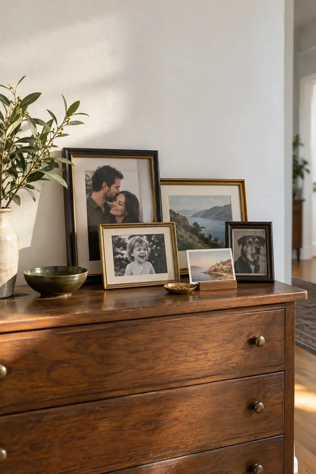
Your favorite pictures do not need an entire wall of nail holes. Arrange framed photographs, small prints, and a postcard on a dresser you already own.

  • Place the largest frame at the back.
  • Overlap a smaller frame near one corner.
  • Leave some bare surface so the display feels collected, not crowded.

Mixing dark and gold-toned frames brings character to plain walls, much like your first reference image. Choose pictures that mean something to you rather than buying a matching set just to fill space.

WordPress HTML

๐Ÿ–ผ๏ธ Choose the surface

Use a steady dresser with enough depth to support the frames.

๐Ÿšช Check the movement

Open nearby doors and drawers to check that nothing knocks the display.

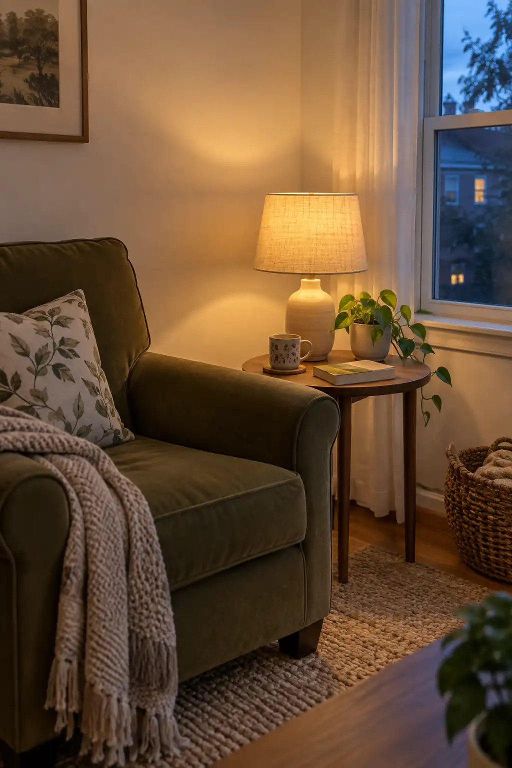
2. Give a Forgotten Corner Its Own Lamp

Overhead lighting can make a room feel like somewhere you are waiting rather than somewhere you live. A small table lamp gives an ordinary corner a purpose.

Set one beside the chair where you read or on the console where you leave your keys. A shaded lamp creates a softer pool of light, while an open shade casts more visible patterns.

Start with the place you actually use after dark. The goal is a comfortable evening routine, not a lamp on every empty surface. Keep its cord out of the walking path.

๐Ÿ’ก Check the view from your seat

Sit down before deciding where the lamp belongs. If the bare bulb shines straight into your eyes, adjust the position or choose a shade that screens it.

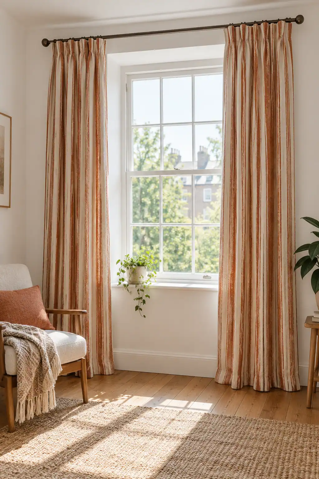
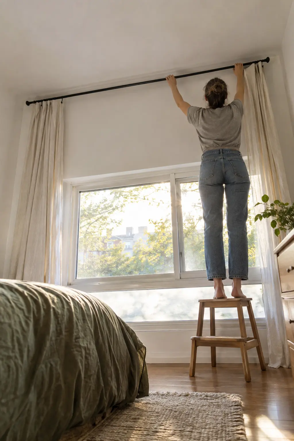
3. Frame the Window With Curtains You Would Choose Yourself

Landlord-supplied blinds may do their job, but they rarely say much about you. Curtains bring your own color and texture into the room without changing the wall finish.

  1. Check whether you can use an existing curtain rod.
  2. Choose fabric for the privacy and light you need.
  3. Measure around radiators, furniture, and the window opening before buying.

A fine stripe feels different from a plain woven curtain, even in similar colors. Where no rod exists, a suitable tension rod may work inside the recess. Check its fit and fabric weight before relying on it.

WordPress HTML

Fabric choiceCheck before choosing
SheerDaytime softness does not guarantee privacy after dark.
Heavier fabricThe rod and fittings must support its weight.

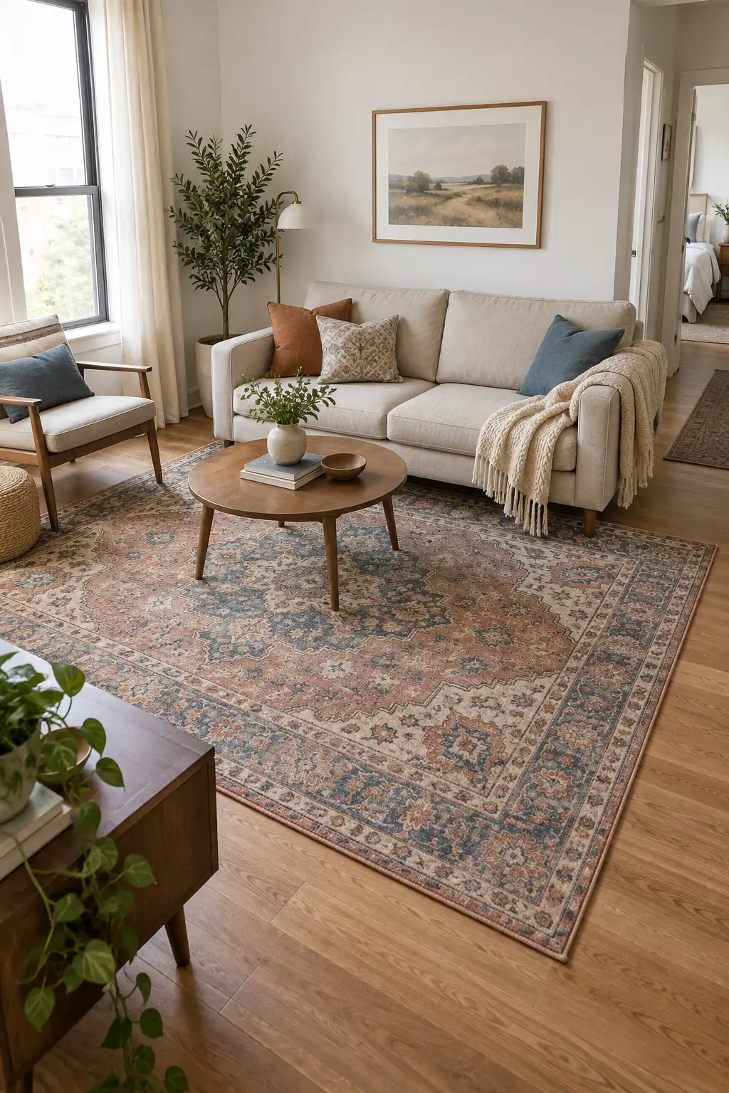
4. Let a Patterned Rug Set the Roomโ€™s Colors

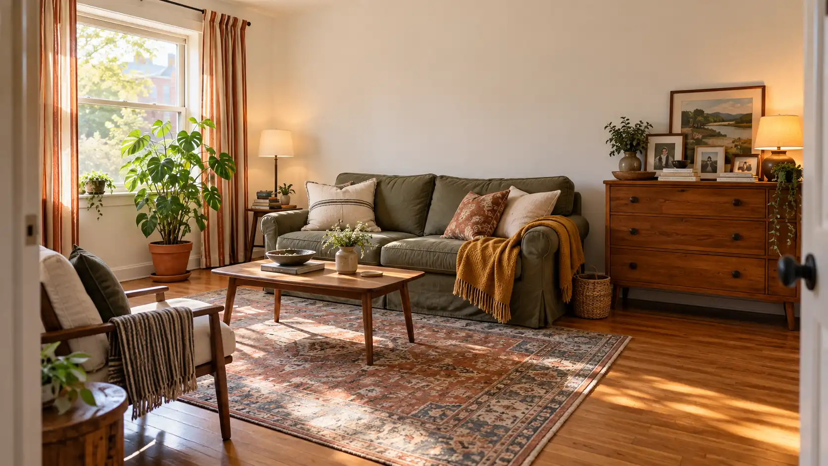
Blank walls feel less demanding when the floor has something worth looking at. A patterned rug can give a plain rental a clear color direction.

For a quieter room: choose a faded pattern with colors close to your sofa.

For a stronger statement: choose a deeper pattern and repeat one of its colors in a small accessory.

Before choosing a size, mark its outline on the floor with loose string. Check how it relates to the main furniture and walking route. A rug that interferes with a door will become annoying long before you stop liking the pattern.

โœ… Check underneath

Choose a rug pad compatible with your flooring and follow its care instructions.

๐Ÿšช Check the edges

Keep corners flat and test the nearby door through its full swing.

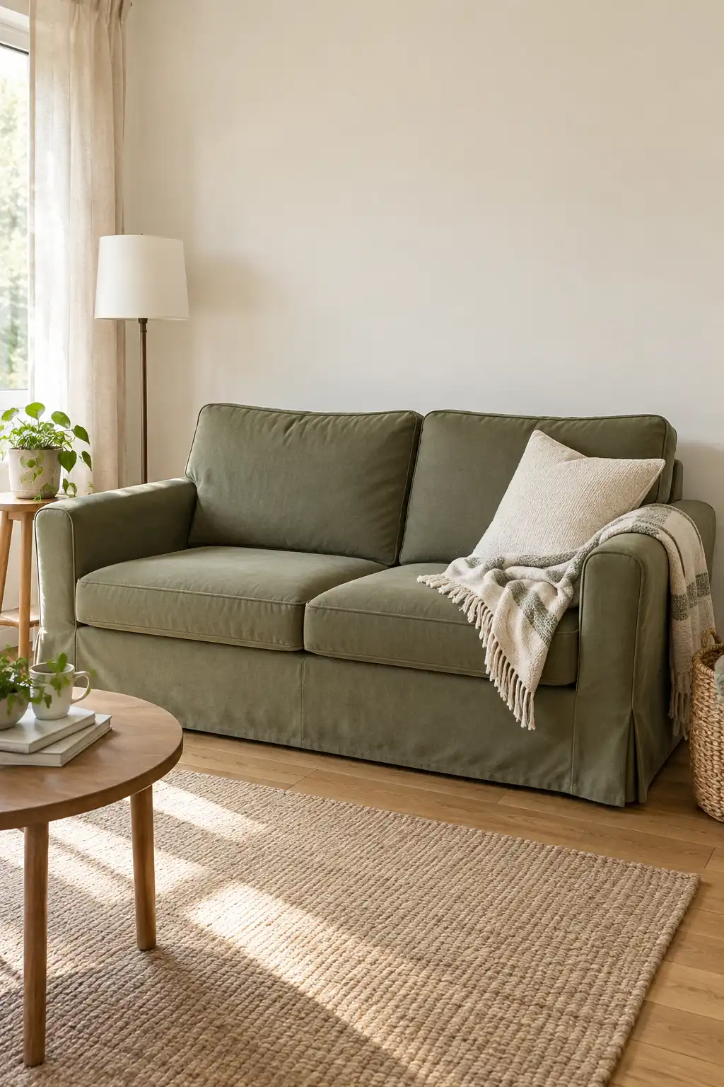
5. Change the Sofaโ€™s Look With a Fitted Cover

The sofa takes up too much visual space to ignore when its color bothers you. A removable cover can change that large block of color without replacing the furniture.

Check the arm shape, cushion arrangement, and measurements first. A cover made for a different sofa shape may shift every time you sit down.

  • Pick a fabric you can care for easily.
  • Tuck it neatly around the seat.
  • Keep the cushions simple if the cover has a strong pattern.

On a furnished rental sofa, check care requirements and avoid fabrics that could transfer dye onto the original upholstery.

๐Ÿ›‹๏ธ Give it a real sitting test

Sit, stand, and settle into your usual spot. A cover that needs constant straightening is a poor fit, even if it looks good in a photo.

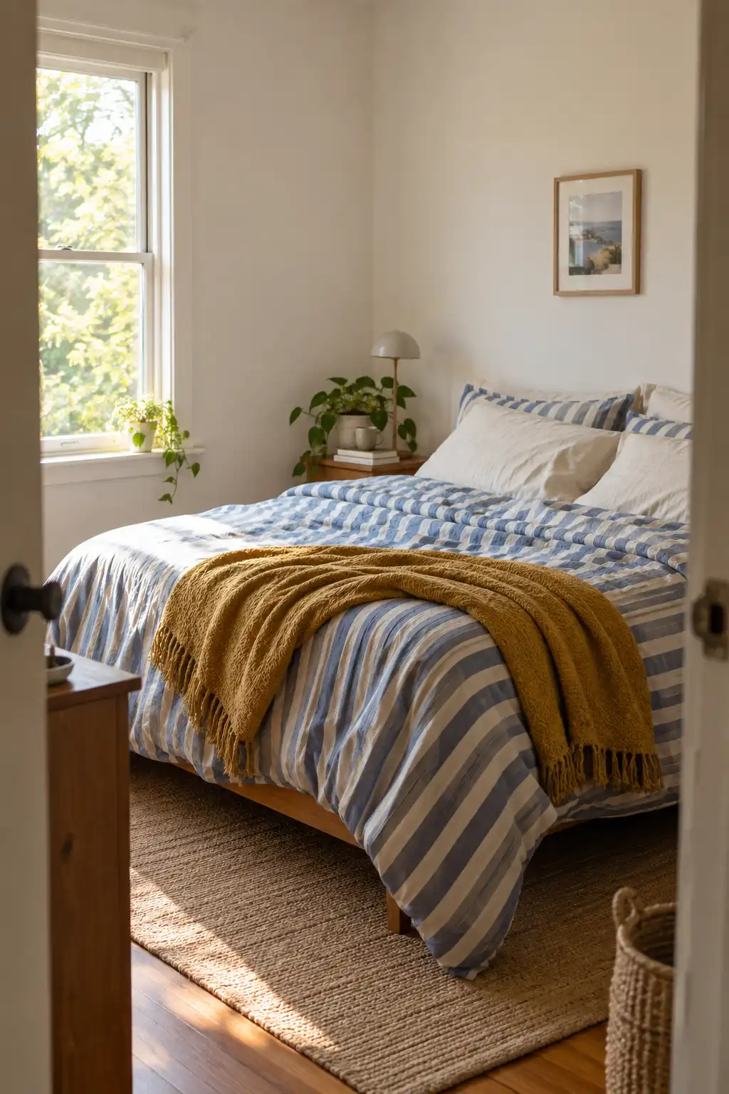
6. Make the Bed Your Main Color Statement

In a small bedroom, the bed is often the largest thing you see. That makes bedding a useful place to express your taste when the walls must stay plain.

Choose a duvet cover you would happily see every morning, then build around it with sheets and a blanket. A striped duvet with solid pillowcases feels lively without needing a matching set.

Keep the everyday routine in mind. If decorative cushions end up on the floor each night, leave them out. The room should feel like yours when you are using it, not only when the bed is freshly made.

๐Ÿงบ Laundry

Check that the largest piece fits your washing setup.

๐ŸŒ™ Comfort

Choose layers you can remove as the room warms up.

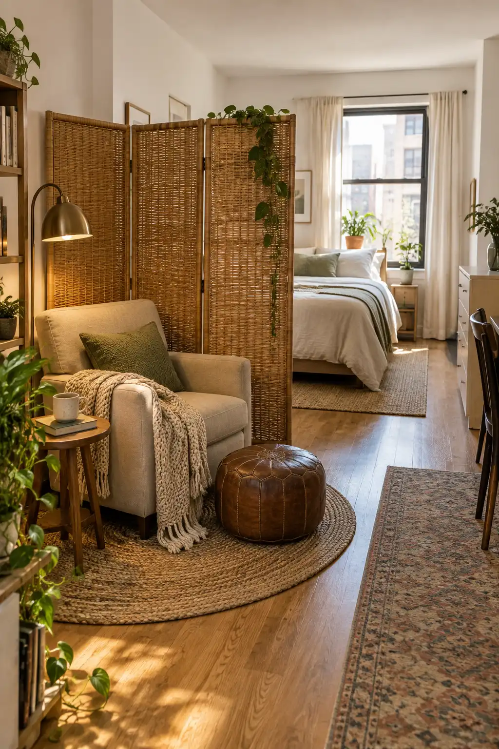
7. Use a Folding Screen as a Movable Backdrop

A folding screen gives you a backdrop you can take with you. Place it behind a reading chair or beside a work area to break up a long, plain wall.

  1. Choose a screen that stands securely in its intended position.
  2. Open the panels to the angle its design requires.
  3. Leave access to outlets, doors, and heating clear.

Woven panels bring texture, while fabric panels can carry a larger pattern. In a studio, the screen can also mark the edge of a sleeping area without pretending it is a full wall.

๐Ÿ“Œ Plan for everyday movement

A screen belongs outside busy paths. Follow its stability instructions and reconsider the location if children or pets could pull or knock it over.

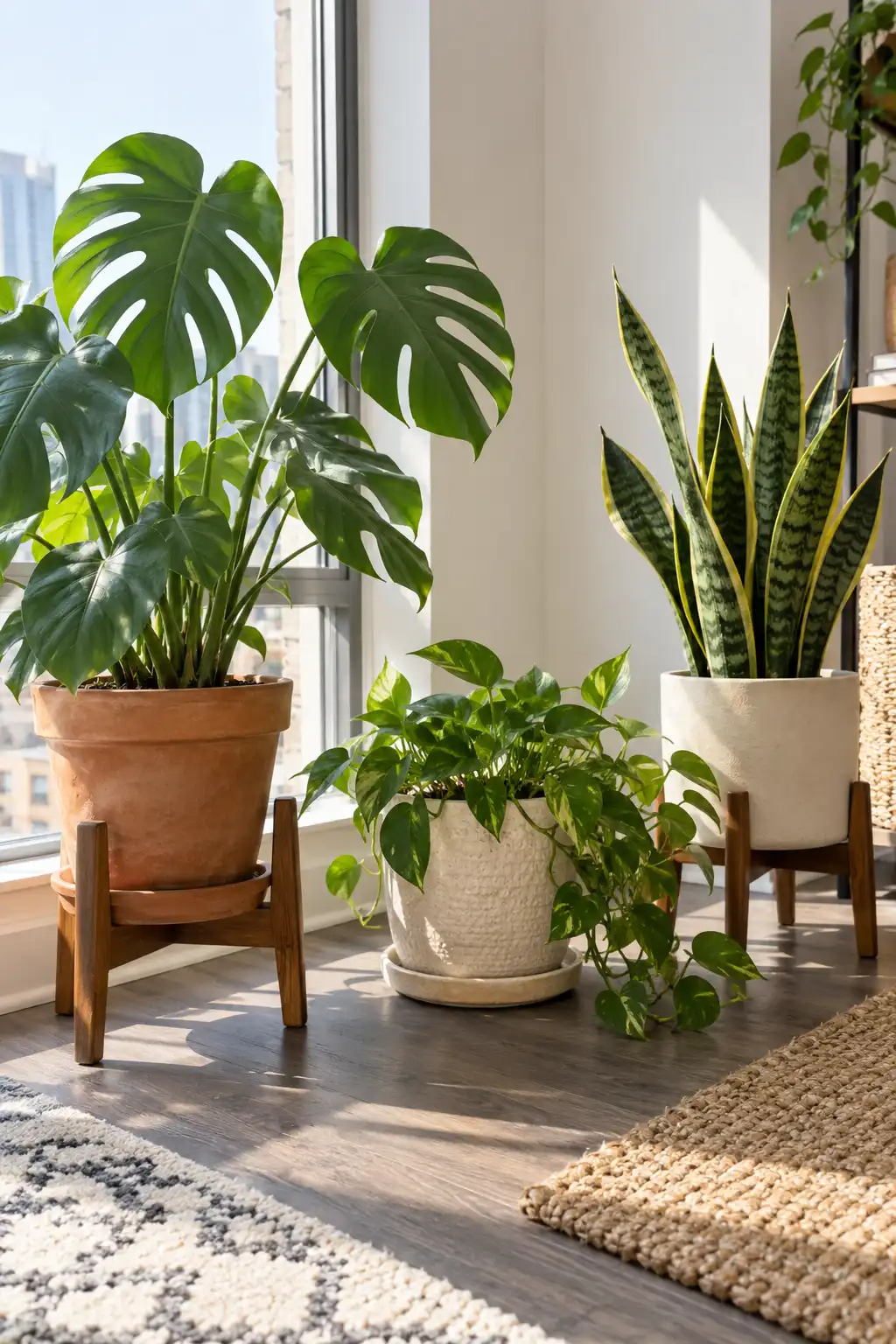
8. Group Plants Where the Light Actually Reaches

A plant corner can make a rental feel cared for, but the location needs to suit the plants. Start with the available daylight, then choose greenery for that spot.

Near a bright window: use plants suited to the actual sun exposure.

In a dim corner: do not assume a plant will thrive simply because it looks good there.

Vary pot heights with a stable stand and a lower floor pot. Keep the containers related through color or texture. A saucer beneath each pot helps catch water, but check underneath regularly rather than trusting it blindly.

โ˜€๏ธ Light match

Check the care needs of the specific plant.

๐Ÿพ Household fit

Check plant suitability if pets or young children can reach it.

9. Dress the Dining Table for Ordinary Days

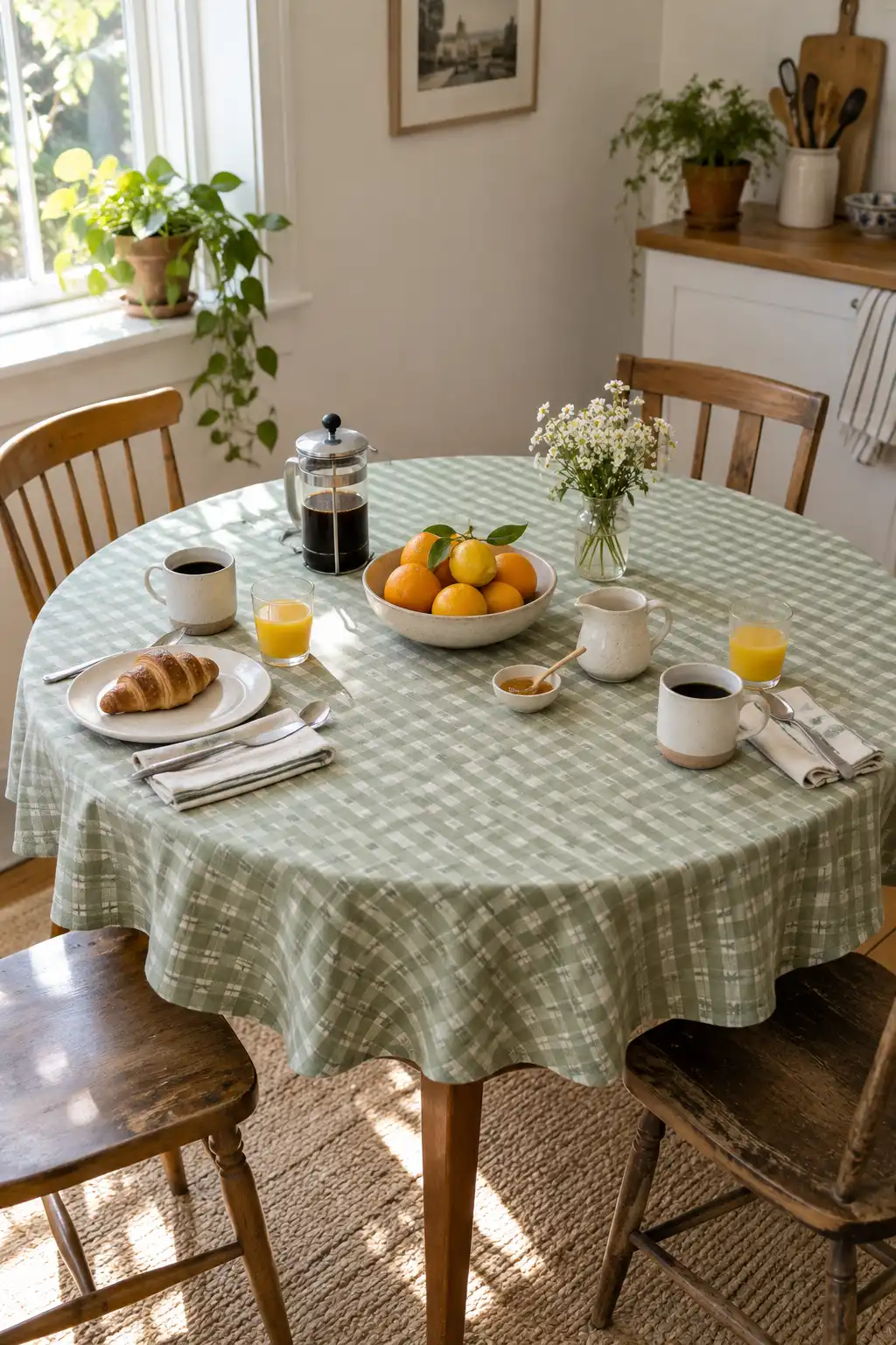
Your dining table does not need to wait for guests to look personal. A fabric runner, everyday placemats, or a favorite fruit bowl can change how the whole corner feels.

  • Choose a washable textile for daily use.
  • Keep the center low enough to talk across.
  • Leave room for the things you actually do there.

A small checked cloth can soften a plain rental dining area without adding another piece of furniture. If the table also handles homework or laptop time, keep the decorative items together so they move aside easily.

๐Ÿฝ๏ธ During meals

Keep enough clear space for plates, glasses, and serving dishes.

๐Ÿ’ป Between meals

Store the centerpiece nearby if this is also your work surface.

10. Swap Cabinet Handles Where Permission Allows

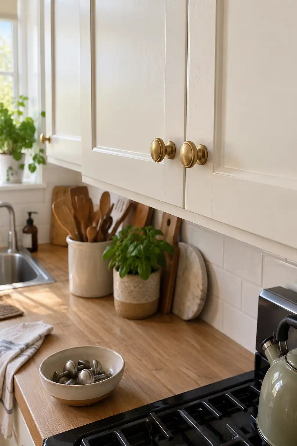
Small hardware changes can make a kitchen feel closer to your taste. Start by checking whether your landlord allows a reversible handle swap.

For replacement pulls, match the existing hole spacing. For knobs, check that the screw and fitting suit the door. New holes turn a simple swap into a different job.

Keep every original handle and screw together in a labeled container. Test a replacement on a single door before buying the rest, including whether it catches on clothing or prevents a neighboring drawer from opening. Good-looking hardware still needs to work comfortably.

๐Ÿ”ง Before you replace anything

  • Confirm the change is allowed.
  • Photograph the original fittings.
  • Match the existing holes and door thickness.
  • Store the originals for move-out.

11. Bring Pattern Into an Open Cabinet With Loose Liners

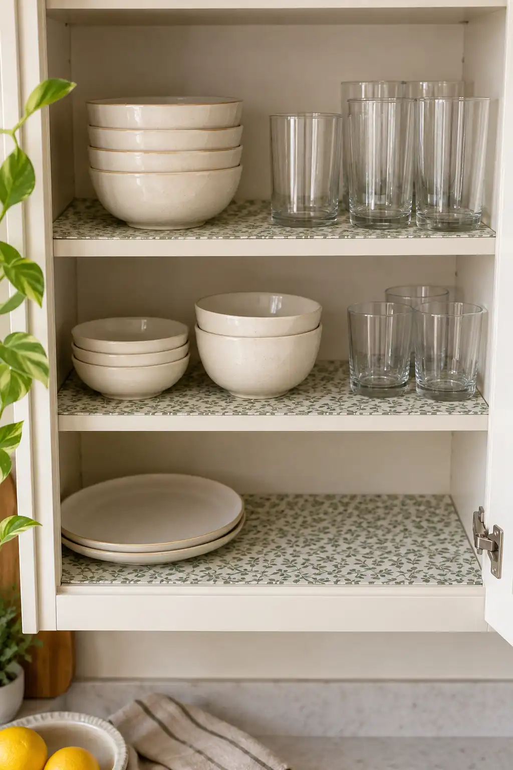
An open cupboard can hold more personality than its plain shelves suggest. A patterned, nonadhesive liner introduces color beneath everyday cups and bowls without covering the walls.

  1. Clean and dry the shelf.
  2. Cut a suitable liner to fit.
  3. Lay it flat without glue or tape.

Choose a material intended for shelf use and compatible with the finish. A small pattern reads neatly between dishes, while a bold one works better on a less crowded shelf. Lift the liner during cleaning so hidden crumbs or moisture do not stay trapped beneath it.

Label to checkWhy it matters
NonadhesiveAvoids relying on glue for placement.
Surface compatibilitySome liner materials can mark certain finishes.

12. Let the Shower Curtain Carry the Bathroomโ€™s Style

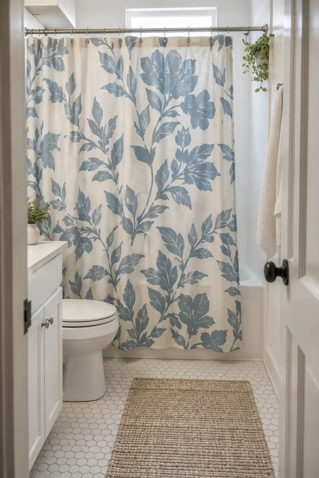
A shower curtain takes up enough space to change the feel of a basic bathroom. Choose a pattern or color you would use elsewhere in your home so the room feels connected to the rest.

Small pattern: useful when you want some detail without a strong focal point.

Large pattern: useful when the bathroom has little else competing for attention.

Use the existing rod if it is suitable, and follow the curtainโ€™s care instructions. Where a separate liner is needed, choose the right fit. Keep the fabric off the floor so the bottom does not sit in puddles.

๐Ÿšฟ Plan for drying

After use, spread the curtain so its folds can dry and use the bathroomโ€™s available ventilation. Follow the washing directions for the fabric and liner.

13. Create a Landing Station Around Your Daily Routine

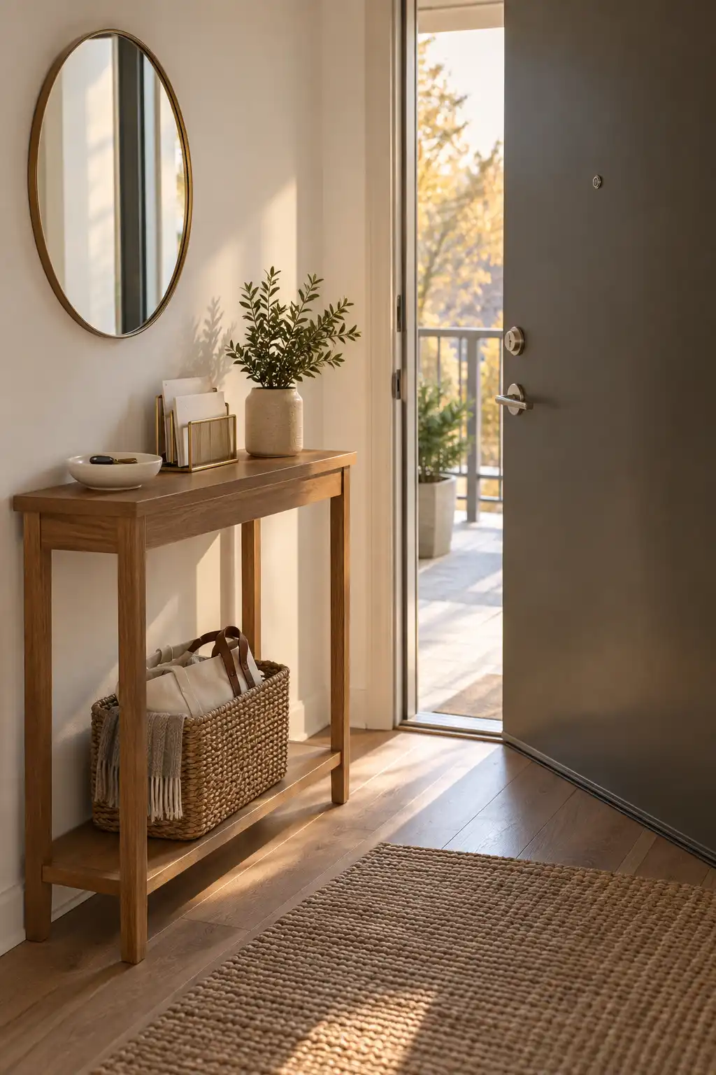
Keys on the counter, mail on the chair, and a bag on the floor make a rental feel unsettled. Give those things a clear home near the entrance.

  • Use a shallow bowl for keys.
  • Put incoming paper in an upright sorter.
  • Slide a basket beneath a console for your everyday bag.

Borrow the useful organization in your third reference image, but keep it on freestanding furniture if wall mounting is not allowed. Choose containers you enjoy looking at. The best arrangement is the one you can use while coming through the door with your hands full.

๐Ÿ“จ Incoming

Keep unread mail in a visible place that is easy to empty.

๐Ÿ‘œ Outgoing

Reserve a separate spot for returns or items leaving with you.

14. Put Your Favorite Books Where You Spend Time

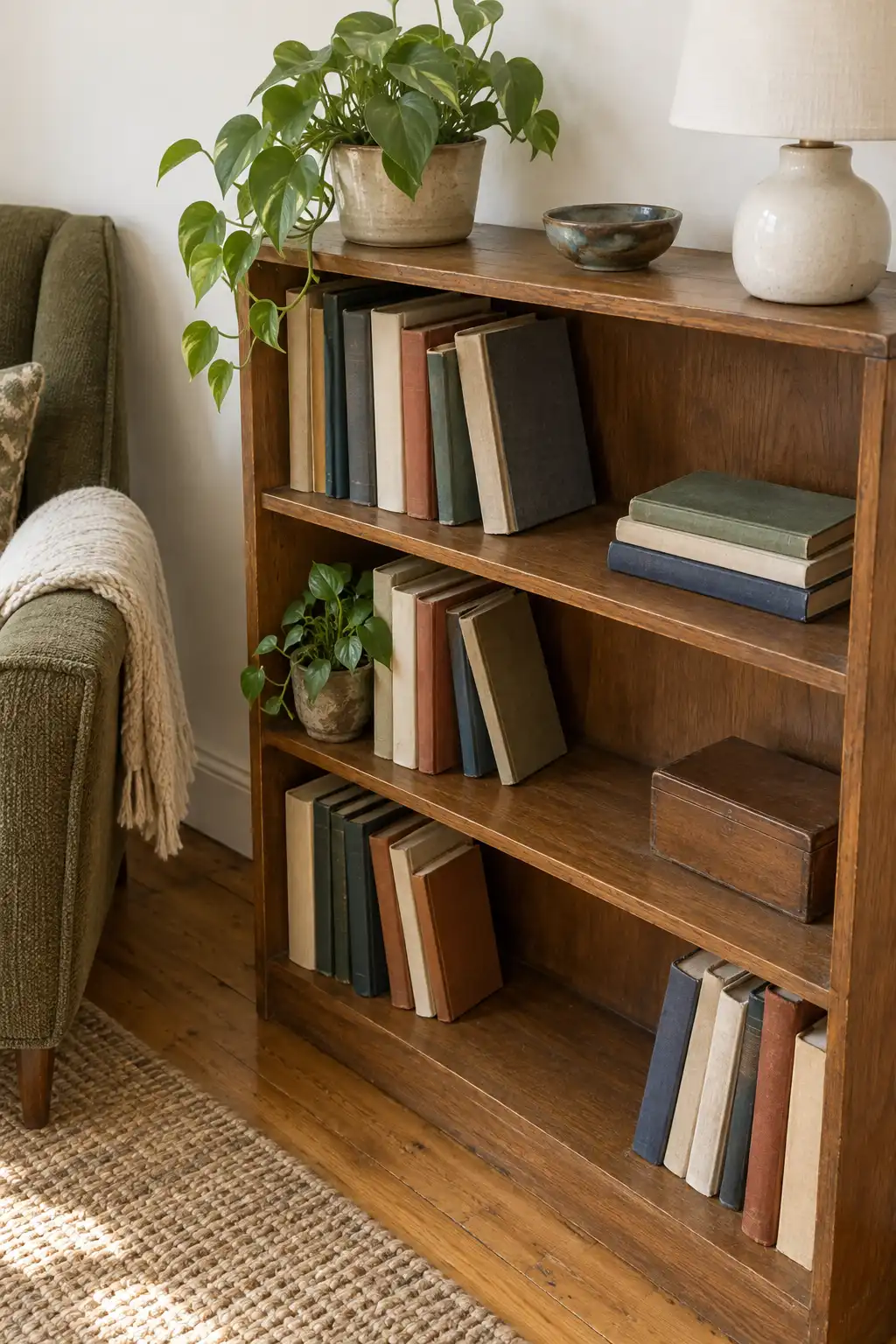
Books can tell visitors more about you than a shelf of matching ornaments. Keep the ones you read, browse, or return to near the place you use them.

A low bookcase beside a chair can hold novels, cookbooks, or a few albums. Mix upright books with a short horizontal stack where it makes practical sense, not just to copy a styled shelf.

Leave some room for new additions. If reaching a book means dismantling a display, simplify it. Follow the furniture makerโ€™s anchoring instructions, and get permission for any required fixings.

๐Ÿ“š Arrange for use

Place frequently used books within easy reach. Keep heavier volumes on lower shelves and avoid loading shelves beyond their stated capacity.

15. Place a Standing Mirror Where It Reflects Something Good

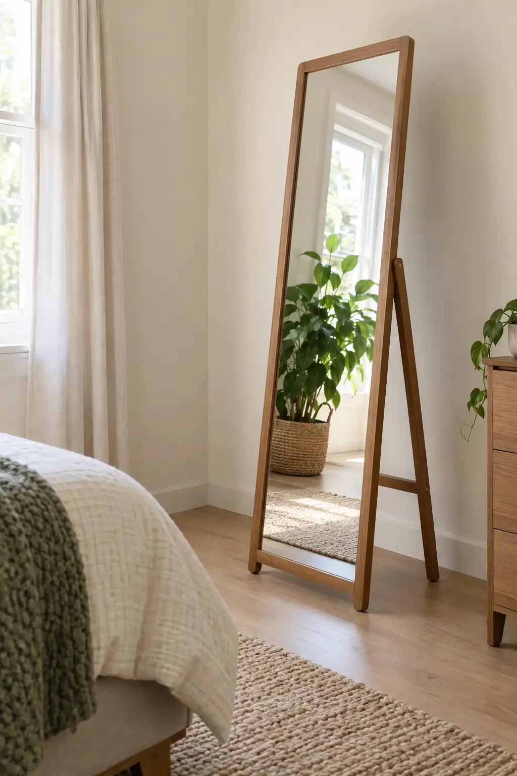
A mirror repeats whatever sits in front of it. Before placing one, check whether it will reflect a bright window, a plant, or the pile of laundry you keep meaning to move.

  1. Test the view from the doorway.
  2. Check the reflection from your usual seat.
  3. Choose the final position around both.

Use a mirror designed to stand in that way, and follow its securing instructions. A loose wall mirror propped on the floor is not automatically a suitable freestanding mirror. The frame can bring in your preferred style while the reflection makes an overlooked corner more useful.

โœ… Reflect a calm view

A clear corner or leafy window view gives the reflection a purpose.

โ˜€๏ธ Check for glare

Avoid an angle that sends bright reflected light toward your seat or screen.

16. Make a Small Desk Feel Like Your Own Workspace

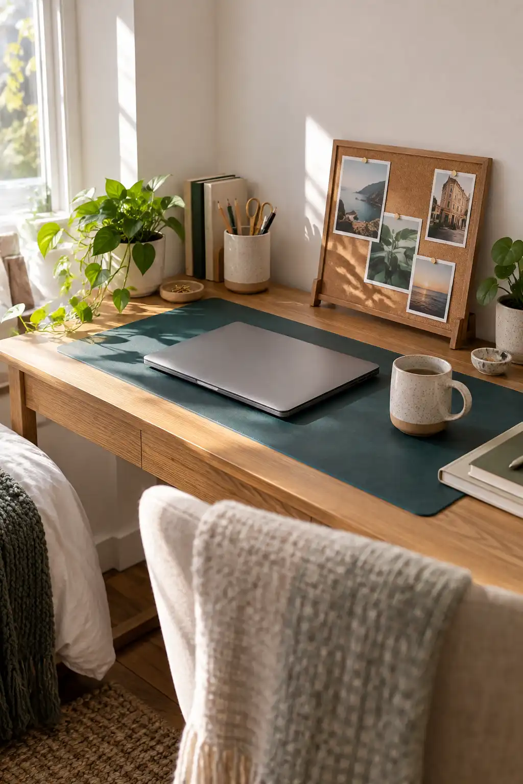
Working at a bare desk in a rented room can feel temporary even after months. A desk mat, a favorite mug, and a useful tabletop organizer give that spot a clearer identity.

For a shared room: keep supplies in a portable caddy you can put away.

For a dedicated corner: choose a larger desk mat to define the work surface.

Keep the colors related, but leave enough room to spread out a notebook. A small freestanding pinboard can hold personal photos without wall fixings. Your workspace should help you settle into work, not give you more objects to move.

๐Ÿ’ป End-of-day reset

  1. Return loose tools to their holder.
  2. Put papers together for the next session.
  3. Clear the space where your hands and notebook go.

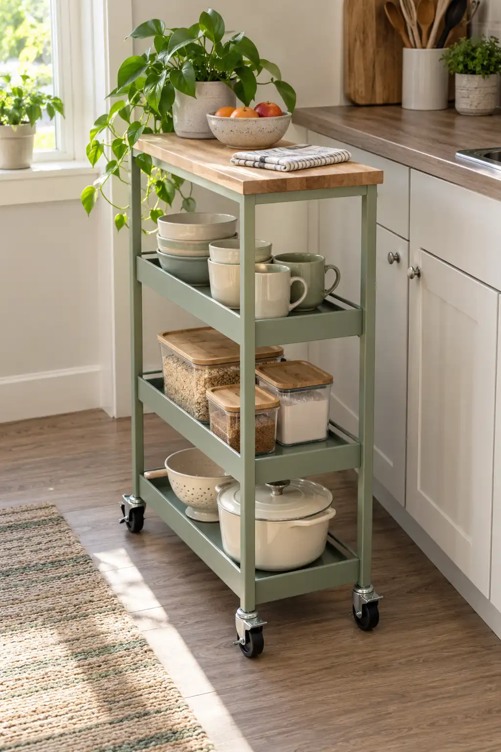
17. Turn a Kitchen Cart Into a Breakfast Station

Limited cabinets do not have to decide where everything lives. A freestanding kitchen cart can hold the mugs, bowls, and breakfast supplies you reach for each morning.

  • Keep daily items on the easiest shelf to reach.
  • Use a bin for small packets.
  • Put heavier supplies lower down.

Choose a cart that fits without narrowing the working path. If it has wheels, lock them when parked. A wooden top or colored frame gives you a finish you chose yourself, even when the fitted kitchen is completely outside your control.

๐Ÿšช Open-door test

Check access to the fridge, oven, and nearby cupboards.

๐Ÿงน Cleaning access

Leave a practical way to clean beneath and behind the cart.

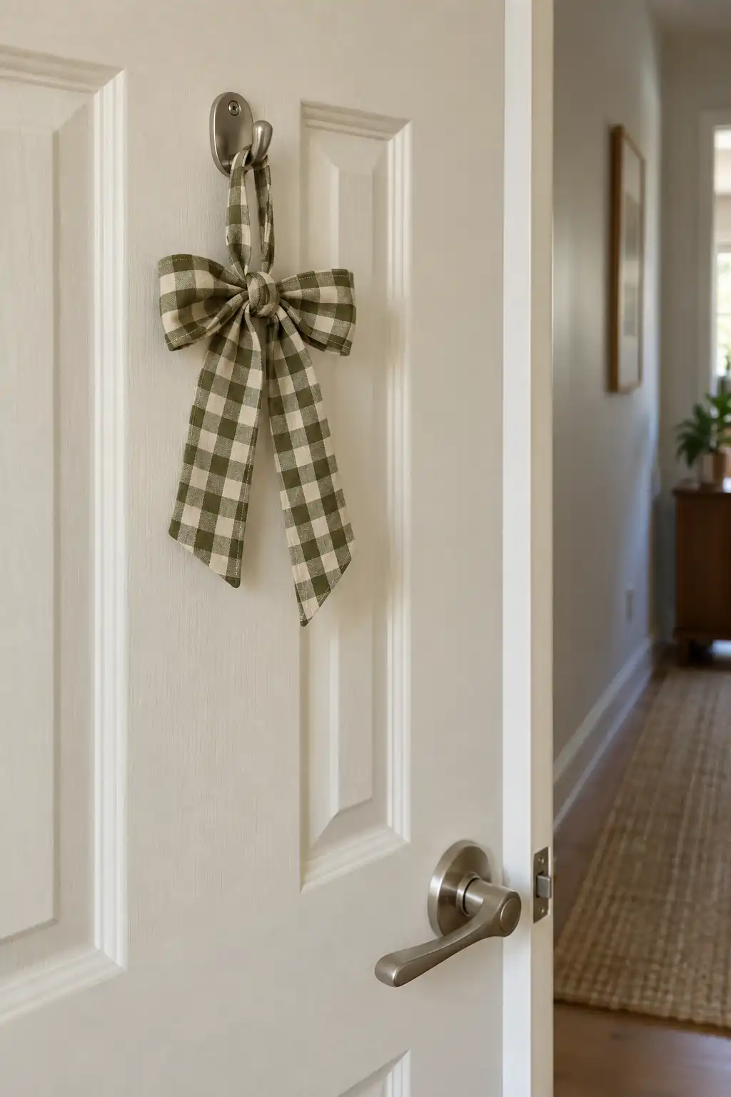
18. Give an Interior Door a Fabric Detail

An interior door is a large blank surface that often gets overlooked. A small fabric decoration can give it character without changing its finish.

Tie a soft fabric bow or a lightweight padded ornament to a suitable existing hook. Pick a textile that connects with another room detail, such as a checked curtain or a striped cushion.

Keep it on an interior door where it will not interfere with the latch or daily use. If you use an over-door hanger, check clearance carefully. Skip anything that stops the door from closing normally or rubs against the frame.

๐Ÿšช Check before leaving it in place

  • The door closes and latches normally.
  • The decoration stays clear of the handle.
  • The hanger does not scrape the door or frame.
  • Any building restrictions are respected.

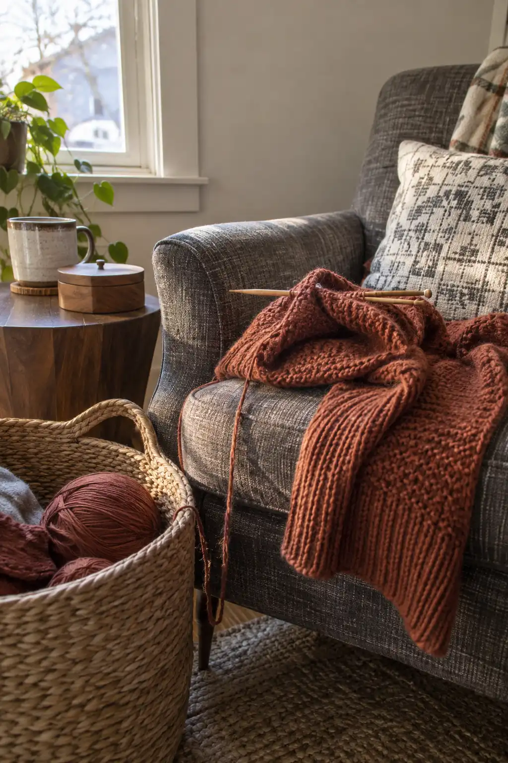
19. Make Room for the Hobby That Makes the Place Yours

A rental feels more personal when your actual interests have a place in it. That might be a basket of knitting beside your chair, a drawing kit near the window, or a small stand for your records.

Choose the activity you already enjoy, then give its supplies a home that is easy to reach. Avoid turning it into a display you are afraid to disturb.

Keep the useful things visible and the loose bits contained. A partly finished project can make a room feel more like yours than another ornament chosen only because it matches.

๐Ÿงถ Let use guide the setup

Keep the current project easy to pick up. Store spare supplies separately so your hobby corner stays ready for doing, not just looking at.

How to Make a Small Room Look Bigger Without Buying Anything New?

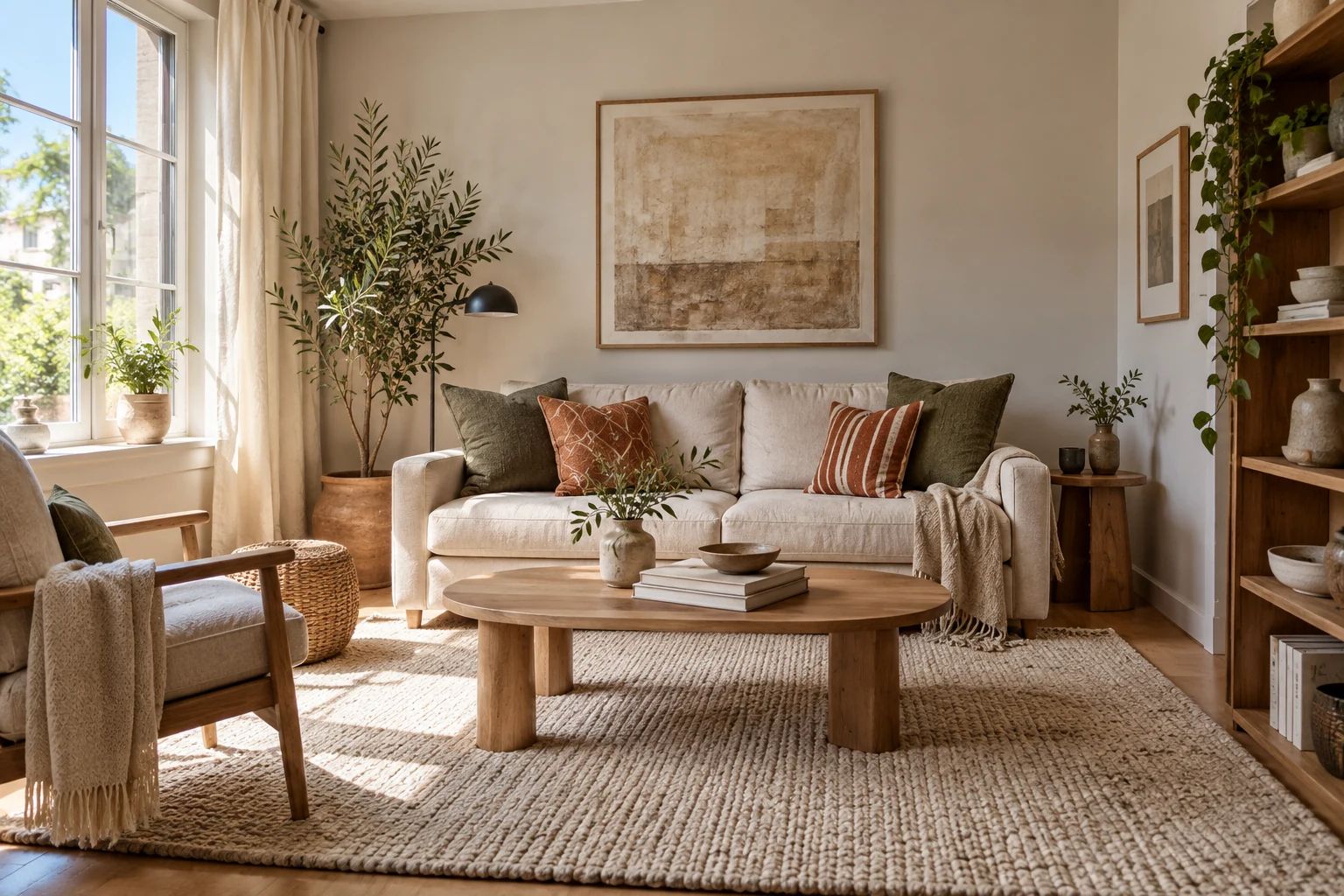
Cream sofa, sage cushions and oak furniture in a sunlit small apartment

9 Zero-Cost Rearrangement Tricks

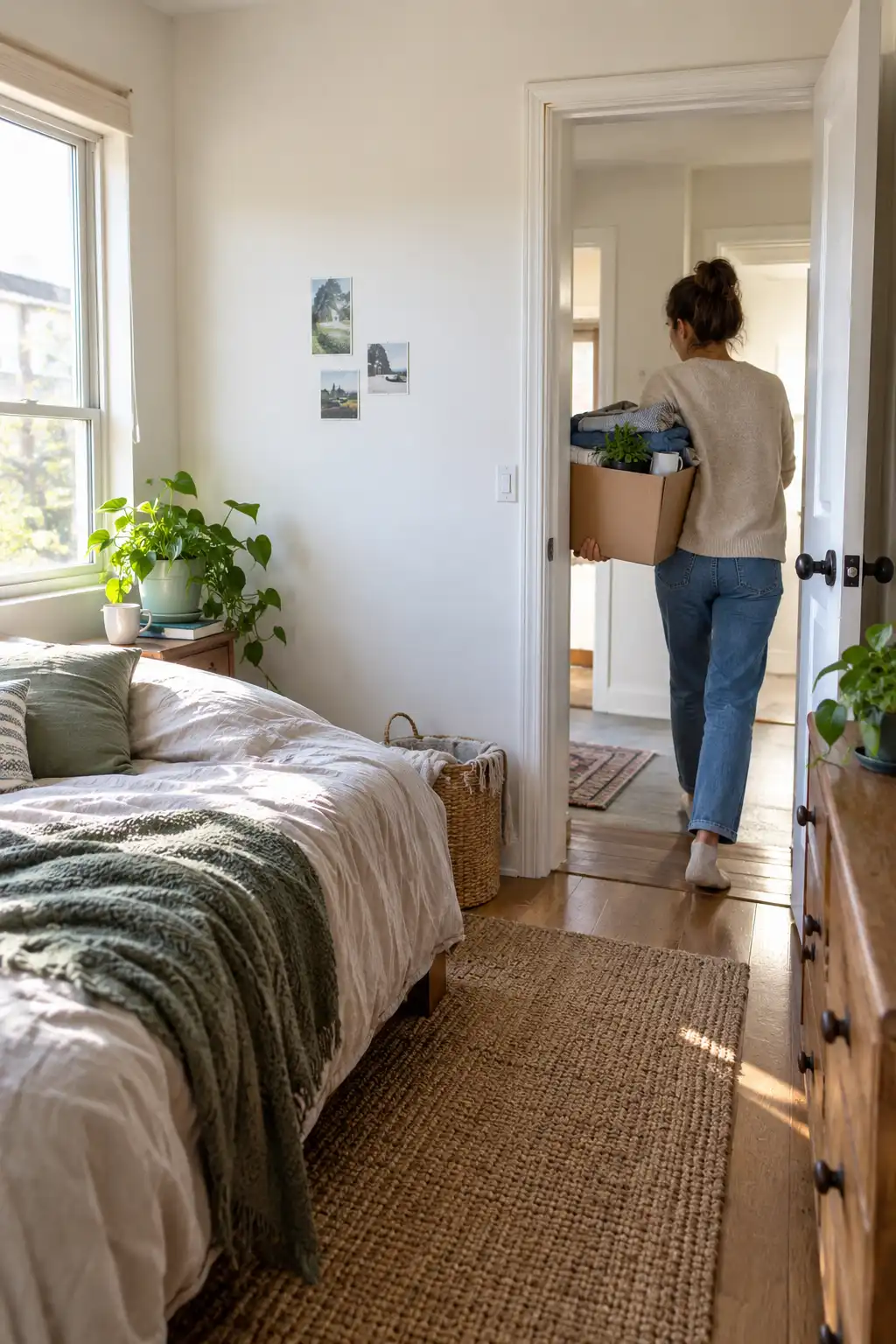
You have stood in your doorway and thought the same thing I used to think: this room is too small, and fixing it means spending money I don’t have. New shelves. A lighter rug. Maybe paint. That was my plan for two years, and my bedroom stayed cramped the whole time.

Then I moved everything out to clean the floors and walked back in. The room felt twice the size โ€” with the same four walls. Nothing was gone. Nothing was new. The furniture was the problem, not the square footage.

This guide shows you how to make a small room look bigger using only what is already inside it. You will pull out what blocks the eye, move furniture off the walls in a specific way, and redirect the light you already have. Every trick here works because of how human vision reads space โ€” and I explain the reason behind each one, so you can apply them in any room later.

Set aside 1 to 3 hours. Most individual changes take under 20 minutes. You need no tools, no budget, and no design experience. Clear the floor, open a window, and start with the hardest part: taking things out.

Total Time
1โ€“3 Hours
Active Time
20 Min Per Step
Difficulty
Beginner
Cost
$0

What You Need

You already own all of it. If something on this list is missing, skip it โ€” nothing here is required.

  • Three empty boxes or laundry baskets
  • A trash bag
  • Any mirror you already own
  • Every lamp in your home
  • A damp cloth
  • Your phone camera
  • A tape measure or a ruler
  • Old socks or felt pads (for sliding furniture)
  • One helper, if furniture is heavy
  • Two hours and an open window

At a Glance

9 Things To Do Today ยท Zero Cost

Phase 1 โ€” Declutter First

  1. Strip the room down to essentials only
  2. Open up empty floor space in every corner
  3. Clear a direct sight line from the doorway

Phase 2 โ€” Rearrange Second

  1. Float furniture 12 inches off the walls
  2. Angle one large piece diagonally
  3. Position mirrors to multiply your light

Phase 3 โ€” Style Third

  1. Layer your existing lights at three heights
  2. Push dark colors back, bring light ones forward
  3. Draw the eye upward with vertical arrangements

Before and After: What Actually Changes

Same room. Same furniture. Same four walls. Here is what shifts.

Before
  • Every piece pushed flat to a wall
  • Corners packed with bags and boxes
  • One ceiling light, flat and harsh
  • Doorway view blocked at chest height
  • Surfaces covered edge to edge
  • Walls end at 4 feet, blank above
After
  • Furniture floated, gap visible behind
  • At least two corners fully bare
  • Three light sources at three heights
  • Clear view to the far wall on entry
  • Two-thirds of each surface empty
  • Eye pulled to the ceiling line

Photograph your room from the doorway before you start. You will not believe the difference otherwise.

1. Strip the room down to essentials only

Remove everything that isn’t furniture, bedding, or a light source. All of it โ€” floor piles, chair-back laundry, surface clutter, the half-full boxes under the desk. Move it to another room entirely.

The room will look bare and slightly sad. That is the point. Your eye needs a blank reading of the actual space before you decide what earns its way back in. Most people never see their room empty, so they measure it by how full it feels instead of how big it is.

Give this 20 to 30 minutes.

2 Open up empty floor space in every corner

Corners are where visual space dies. A bag propped in one, a stack of books in another, and the brain reads the room as ending several inches early on all sides.

Pick two corners and leave them completely bare โ€” floor visible, nothing leaning, nothing stacked. The far corners from the door matter most, because those are the ones your eye lands on first when you walk in.

If a corner holds something that cannot move, like a radiator or a wardrobe, clear the floor at least 18 inches out from its base instead.

Pro Tip

Visible floor is the single strongest signal of size a room can send. Any square foot of bare floor your eye can trace reads as available space โ€” even if you never walk on it. Clearing under a bed or behind a door buys you more perceived room than moving a whole sofa.

3 Clear a direct sight line from the doorway through the room

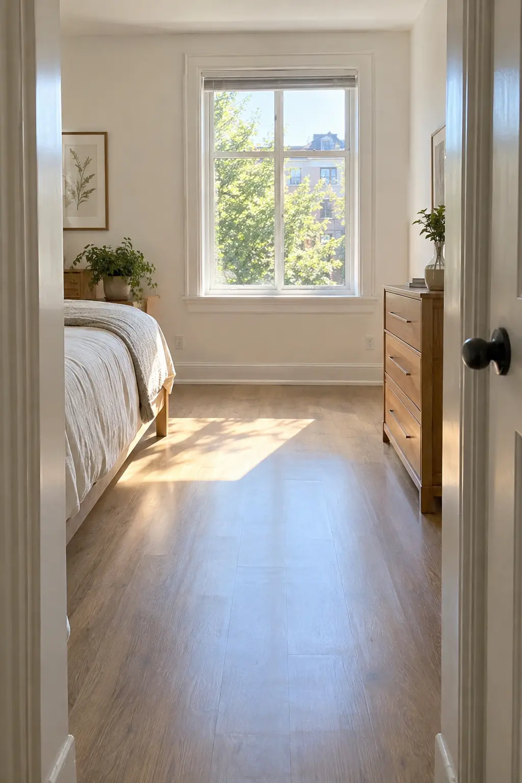
Stand in the doorway and look straight ahead at eye level. Anything sitting between you and the far wall โ€” a chair back, a tall lamp, an open shelf โ€” cuts the room in half before you have taken a step.

Move those pieces out of that center channel. Low items are fine. A bed, a bench, or a coffee table sits below your sightline and does not interrupt it.

Keep a walking path at least 30 inches wide running from the door to the window or far wall. Rooms feel small when the body has to turn sideways to cross them.

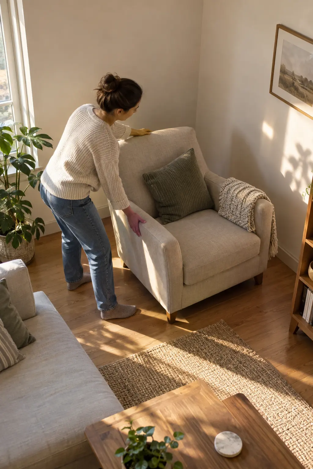
4 Float furniture at least 12 inches away from walls

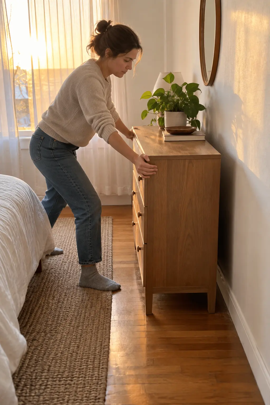
Twelve inches is the number that changes a room. Pull your largest piece โ€” bed, sofa, dresser โ€” forward until that gap sits behind it, then check the walking space in front.

This feels wrong the first time. Everyone assumes wall-hugging saves space. It does the opposite: when furniture touches the wall, the eye reads the furniture edge as the room edge and stops there. A visible gap tells your brain the wall continues past the object, so the room reads deeper than it measures.

Short on room? Six inches still works.

Furniture Placement: Do and Don’t

The five moves that matter most

Don’t
  • Push every piece flat against a wall
  • Line tall furniture along the entry wall
  • Center a big piece in the doorway view
  • Park two bulky items in the same corner
  • Leave legs hidden behind skirts or boxes
Do
  • Leave a 6โ€“12 inch gap behind large pieces
  • Keep tall furniture on the far wall only
  • Put low items in the center sightline
  • Spread bulk across opposite walls
  • Expose furniture legs so floor shows through

Why it works: Your eye measures a room by how much floor it can trace uninterrupted. Every gap, every visible leg, every clear corner adds to that count.

5 Angle one large piece diagonally to widen the room

Which wall is your longest? Find it, then turn one substantial piece โ€” an armchair, a desk, a dresser โ€” so it sits at roughly 45 degrees to that wall instead of parallel to it.

Here is the reason this works, and it is worth understanding: a square or rectangular room gives your eye four straight lines to follow, and the shortest one sets your sense of the room’s size. A diagonal introduces a longer line โ€” the hypotenuse โ€” that runs corner to corner. Your brain follows the longest available line when judging distance. One angled piece hands it a line that is physically longer than any wall in the room, and the space reads wider without a single inch changing.

Angle one piece only. Two or more and the room turns into an obstacle course.

Heads Up

Never angle a piece that blocks a door swing, a window, or a heat vent. Test the door fully open before you commit. In rooms under 80 square feet, skip this step entirely โ€” a diagonal eats floor space that a small room cannot spare, and you will lose more than you gain.

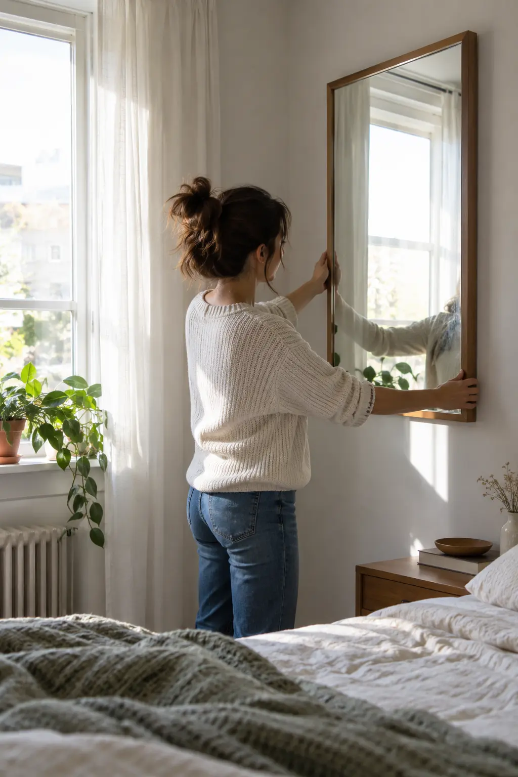
6 Position mirrors to multiply existing light sources

Say you own one mirror. Where it hangs decides whether it doubles your room or does nothing at all.

Place it on the wall at a right angle to your window, not the wall directly opposite. A mirror facing a window reflects the outside view flatly. A mirror set perpendicular catches that light and throws it sideways across the room, which brightens the wall your eye reads as the far boundary.

Check the reflection before you commit: it should show open space or a light source โ€” never a cluttered surface or a closed door.

Where to Put the Mirror You Already Own

Same mirror, four possible walls. Only two of them help.

Best Spots

Wall at 90ยฐ to the window. Bounces daylight deep into the room instead of straight back out.

End of a narrow room or hallway. Reads as a continuing passage and stretches the length.

Behind a lamp. Turns one bulb into two visible light sources after dark.

Wasted Spots

Directly facing the window. Reflects glare, not space.

Facing a cluttered shelf or worktop. Doubles the mess and makes the room feel fuller.

Below waist height. Nothing useful reflects at that level โ€” mount the center at roughly 57 inches from the floor.

No wall mirror? Lean a full-length one against the wall in a bare corner, or prop a closet-door mirror at a slight angle. Leaning works โ€” and costs nothing.

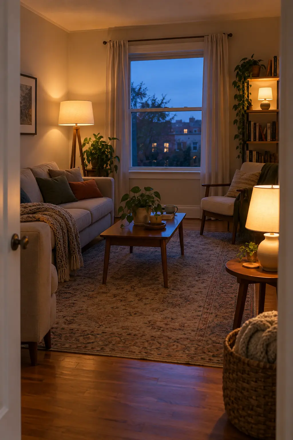
7 Layer your existing lights at three heights

One ceiling bulb flattens a room. It throws light down from a single point, which erases the shadows that give a space depth โ€” and a flat room reads as a small room.

Gather every lamp you own from the rest of your home. Set them at three levels:

  • One on the floor or low shelf
  • One at table height
  • One high, on a dresser or wall hook

Turn the ceiling light off and check the difference.

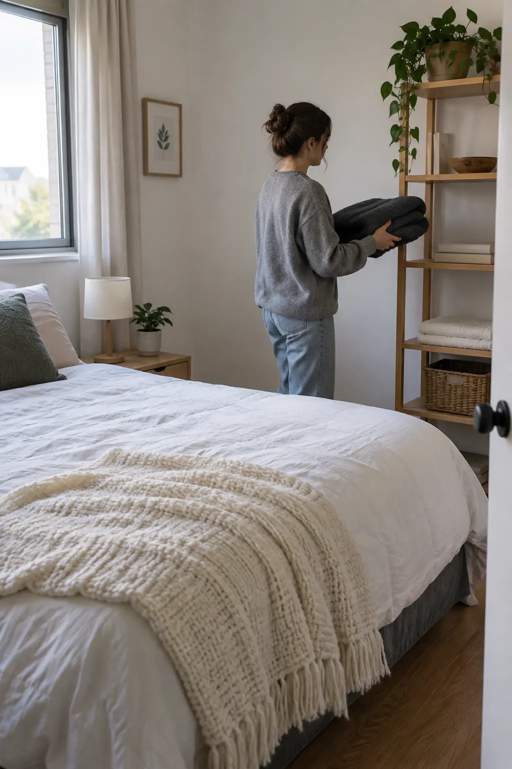
8 Push dark colors to the background and bring light ones forward

Ten minutes of swapping what you already own does most of this. Dark objects advance toward the eye. Pale ones recede. So a charcoal throw folded on the bed pulls the bed closer to you, while that same throw on the far wall’s shelf pushes that wall back.

Move your darkest pieces โ€” blankets, storage boxes, art โ€” to the wall furthest from the door. Bring pale ones near the entry.

Color and Light Cheat Sheet

Work with the colors already in your room. Nothing here needs paint or a purchase.

Lean Into These
  • Whites, creams, pale grey
  • Raw wood and natural linen
  • Anything that matches your wall color
  • Reflective surfaces โ€” glass, metal, chrome
  • Bare floor where you can expose it
Push These Back
  • Black, navy, deep brown
  • Busy patterns and loud prints
  • High-contrast color pairings
  • Bulky dark textiles near the door
  • Anything that fights the wall color

The rule underneath it all: the closer an object’s color is to the wall behind it, the less the eye registers it as taking up space. Match, and the object disappears. Contrast, and it juts forward.

9 Draw the eye upward with vertical arrangements

Two-thirds of most walls sit empty above the four-foot line, and that unused height is free space your room is not claiming.

Hang existing art higher than feels natural. Stack books vertically rather than in flat piles. Move a tall item into a corner so it reaches toward the ceiling.

The eye follows the highest thing in a room. Raise it, and the ceiling reads further away.

Pro Tip

If you already own curtains, rehang the rod 4 to 6 inches below the ceiling instead of directly above the window frame. Same curtains, same window โ€” the wall now reads as taller, and the window looks larger than it is. This is the highest-impact free change in the whole guide.

Troubleshooting: If This Happens, Try This

The room looks bigger but feels emptier, not betterBring back one item from the pile you removed in Step 1 โ€” the one you missed most. A totally stripped room reads as unfinished, not spacious.
The diagonal furniture placement feels awkward to walk aroundReduce the angle to 20โ€“30 degrees instead of a full 45. A slight turn still lengthens the sightline without blocking your path.
The mirror is just reflecting clutter from another spotStand where you’ll usually be in the room and check the reflection from that exact spot, not from the doorway. Adjust the tilt or move it to a different perpendicular wall.
There’s no 12 inches to spare behind the furnitureUse whatever gap you can get, even 2 to 3 inches. Any visible gap outperforms furniture flush against the wall.
The room still feels small after all 9 stepsRetake your doorway photo and compare it to the original. Improvement is often more visible in a photo than in person, since you’ve been adjusting to the space gradually.

Questions Beginners Actually Ask

Does this work in a small bedroom, or only a living room?

It works in any room shape, including a small bedroom. The bed is your largest piece, so float it off the wall first and treat that as your Step 4.

What if I barely have any furniture to rearrange?

Focus on Steps 1, 2, 3, and 7 โ€” decluttering, corners, sightlines, and lighting matter even more when a room is sparse, since every remaining object carries more visual weight.

I share this room. Can I still do this without upsetting anyone’s stuff?

Yes. Ask your roommate to pick which of their items are essential before Step 1, then apply the rest of the steps around the pieces that stay.

How long will the room actually stay looking bigger?

As long as you don’t let the corners and floor gaps refill with clutter. A five-minute reset once a week keeps the layout intact.

Do I need to do all 9 steps, or can I just do a few?

A few still help. Steps 1, 4, and 6 give the biggest visible change for the least effort if you’re short on time.

๐Ÿ“Œ Quick Reference Card

Save or screenshot this part

What You Need

Empty boxes ยท trash bag ยท your mirror ยท every lamp you own ยท damp cloth ยท phone camera ยท tape measure ยท felt pads or old socks

The 9 Steps

  1. Strip the room to essentials only
  2. Bare two corners completely
  3. Clear a 30-inch sightline from the door
  4. Float furniture 6โ€“12 inches off the walls
  5. Angle one large piece 45 degrees
  6. Set mirror perpendicular to the window
  7. Layer lamps at three heights
  8. Dark colors back, light colors forward
  9. Hang curtains and art higher

Total time: 1โ€“3 hours ยท Cost: $0

You’re Done

Stand in the doorway one more time and take that second photo. Compare it to the one from Step 1 โ€” same angle, same room, nothing new in the frame. That difference is the whole point of learning how to make a small room look bigger: it was never about square footage; it was about what your eye was allowed to see.

Pick one step to revisit next week, once the new layout has settled and you notice what still feels tight.

Save this pin so you don’t lose the checklist before Saturday. ๐Ÿ“Œ