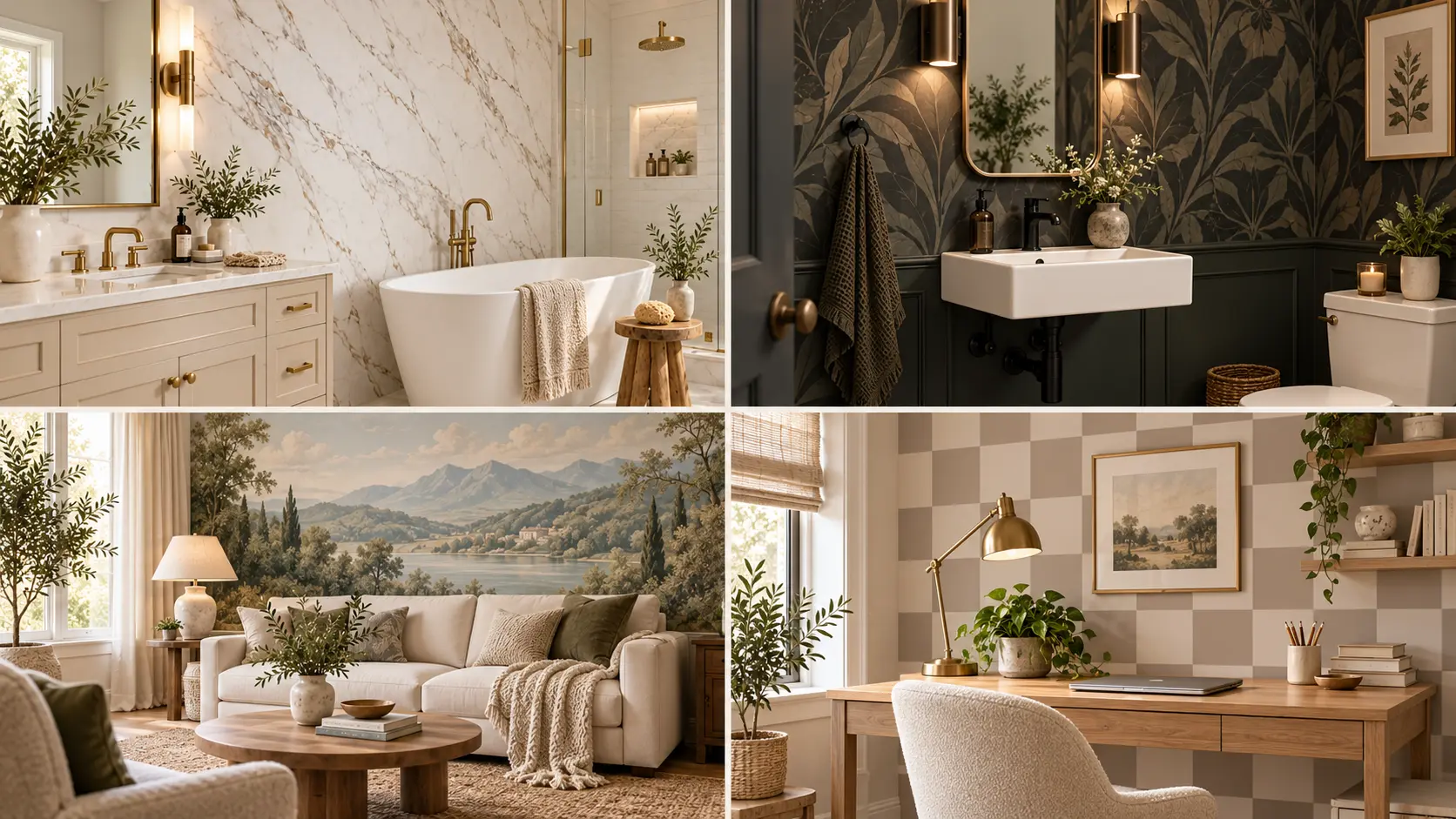
Peel and stick wallpaper has come a long way from the shiny patterns and obvious repeats that can make a rental wall look temporary. The right print, scale, color palette, and placement can make it feel much closer to a thoughtful wall finish than a quick decorating fix.
These peel-and-stick wallpaper ideas for renters focus on designs that look considered once they are part of the room. Think soft linen textures behind a bed, oversized murals that replace a wall full of art, quiet plaster effects, bold powder room patterns, framed wallpaper panels, and warm block prints that work with the furniture you already own.
The key is not covering every wall. Often, one carefully chosen surface creates a stronger result. Pattern size, surrounding furniture, lighting, and even where the wallpaper stops can change how convincing it looks.
Use these ideas as inspiration for creating a rental that feels personal now, while keeping your decorating choices flexible for the future.
1. Fake the Look of Full Slab Marble
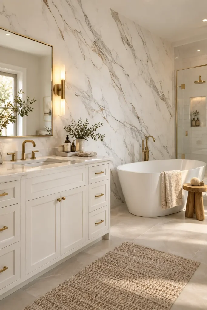
Large-scale stone patterns can make peel-and-stick wallpaper feel much more expensive than small repeating prints. The trick is choosing a design with long, loose veining instead of lots of tiny gray marks.
For a bathroom or vanity wall, keep the rest of the room quiet:
- warm white surfaces
- simple metal finishes
- very little wall clutter
Use the wallpaper on one uninterrupted wall whenever possible. Too many corners and cutouts can expose seams and make the finish feel temporary.
The strongest version of this idea is calm, oversized, and simple.
💡 Make It Look More Real
Choose wide stone veining and fewer obvious repeats. A busy marble print can quickly reveal that the surface is wallpaper.
2. Use a Dark Organic Print in a Small Zone
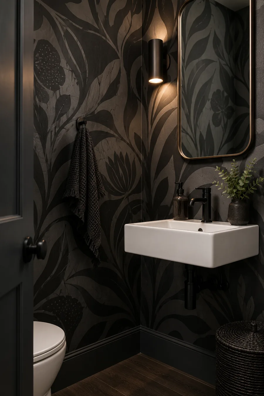
Dark wallpaper does not have to cover a whole room. A compact wall, nook, powder room, or narrow passage can handle a bold organic pattern surprisingly well.
Start with a design that has:
- a deep background
- large flowing shapes
- only a few colors
Then let the wallpaper do most of the work. Too many frames, signs, and accessories can make a strong pattern feel crowded.
A small area is also easier for renters because there are fewer panels to align and less material to remove later.
The result feels intentional because the print has a clear boundary instead of slowly taking over the room.
Build the look
3. Make an Entryway Feel Custom With an Abstract Neutral Pattern
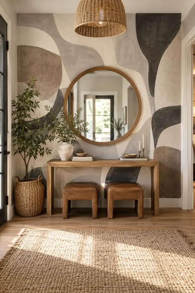
An entryway is a smart place for peel-and-stick wallpaper because even a small amount can give the space a clear identity.
Instead of a tiny repeated motif, look for large abstract shapes in earthy neutrals. Cream, charcoal, taupe, clay, and muted brown tend to work well with wood furniture and simple mirrors.
Keep the furniture narrower than the wallpapered section so the pattern still shows around it. A console, round mirror, plant, and low stools or baskets are enough to make the area feel finished.
Avoid matching every accessory to the wallpaper. A few natural materials keep the room from looking too coordinated.
Large abstract forms.
Warm wood and simple shapes.
Too many tiny accessories.
Furniture that hides most of the pattern.
4. Try a Crisp Geometric Print Behind Open Kitchen Shelves
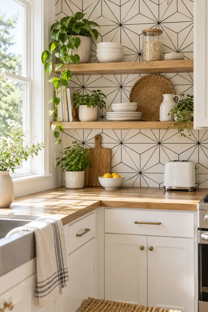
A black-and-white geometric wallpaper can work especially well in a rental kitchen because the pattern reads more like a designed backsplash or wall treatment than a temporary covering.
The cleanest approach is to use it behind open shelving or along one clear section of wall.
Pair it with:
- warm wood
- white cabinetry
- simple ceramics
- a few green plants
The contrast keeps the wall graphic, while the natural materials stop it from feeling harsh.
Before applying anything near cooking or washing areas, check the wallpaper maker’s instructions for moisture, heat, cleaning, and suitable surfaces.
Coverage tracker ab 4 distinct directions cover kar chuka hai: stone look, dark organic pattern, abstract neutral feature wall, aur graphic geometric kitchen treatment.
Tumhara article target 21 ideas hai, isliye ab 17 fresh AI ideas chahiye honge jo in four concepts ko repeat nahi karenge.
continue
5. Choose a Linen Look Behind the Bed
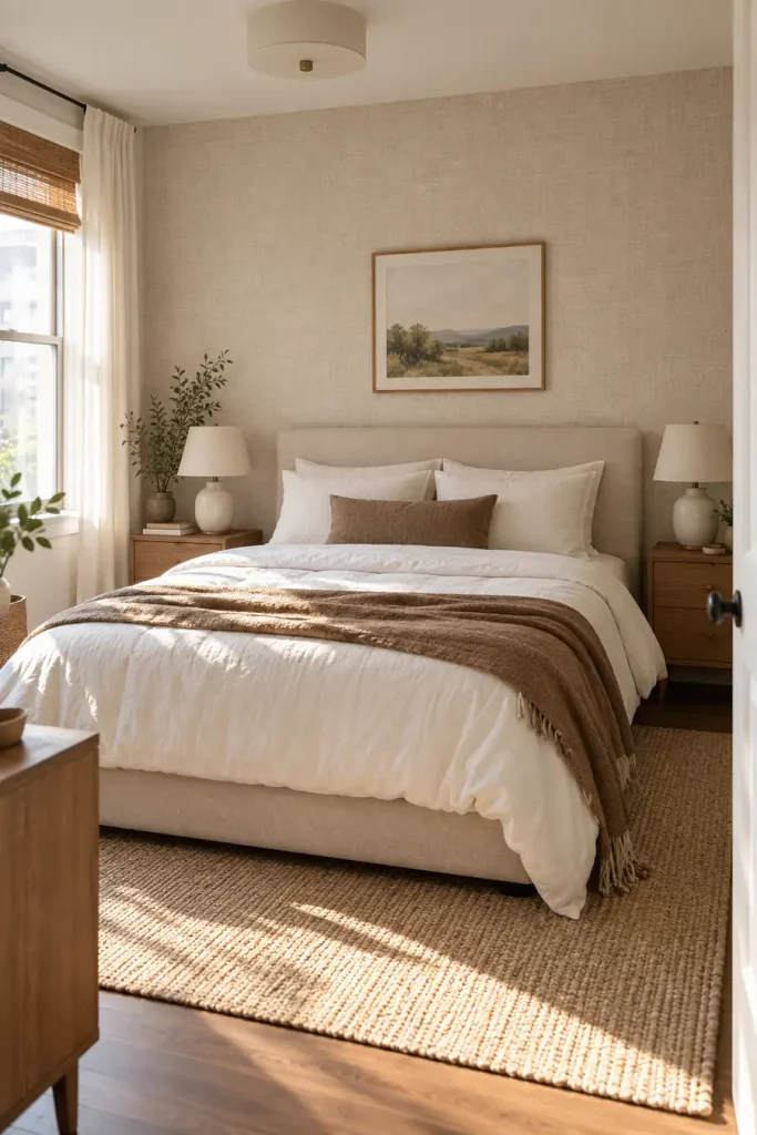
A soft woven pattern can make a bedroom wall feel closer to fabric or textured plaster than printed wallpaper. Keep the color quiet, such as warm oatmeal, soft beige, dusty taupe, or pale mushroom.
The best setup is simple:
- cover only the wall behind the bed
- use solid bedding instead of another busy print
- repeat the wallpaper color in one or two pillows
- keep bedside lighting warm
Fine texture works best when you can see it up close without noticing an obvious repeating motif.
💡 Styling Tip
Let the texture be the pattern. Solid bedding and simple lamps keep a linen look from competing with too many other details.
6. Turn One Wall Into a Quiet Landscape Mural
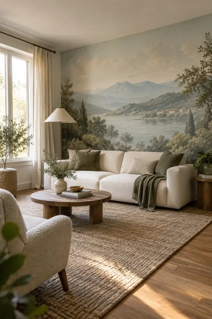
A mural can look surprisingly permanent when it feels more like artwork than wallpaper.
Choose a scene with soft edges and restrained color. Misty hills, faded trees, cloudy skies, or a washed coastal landscape can fill a living room wall without making it feel like a giant printed poster.
Before: a long blank wall that needs several pieces of art.
After: one continuous scene that becomes the room’s main visual feature.
Keep furniture low enough that the most interesting part of the mural stays visible. A plain sofa and a few solid cushions are usually enough around it.
A large blank wall that feels unfinished and needs several decorations.
One soft landscape becomes the focal point while the furniture stays simple.
7. Fake Grasscloth With a Warm Woven Pattern
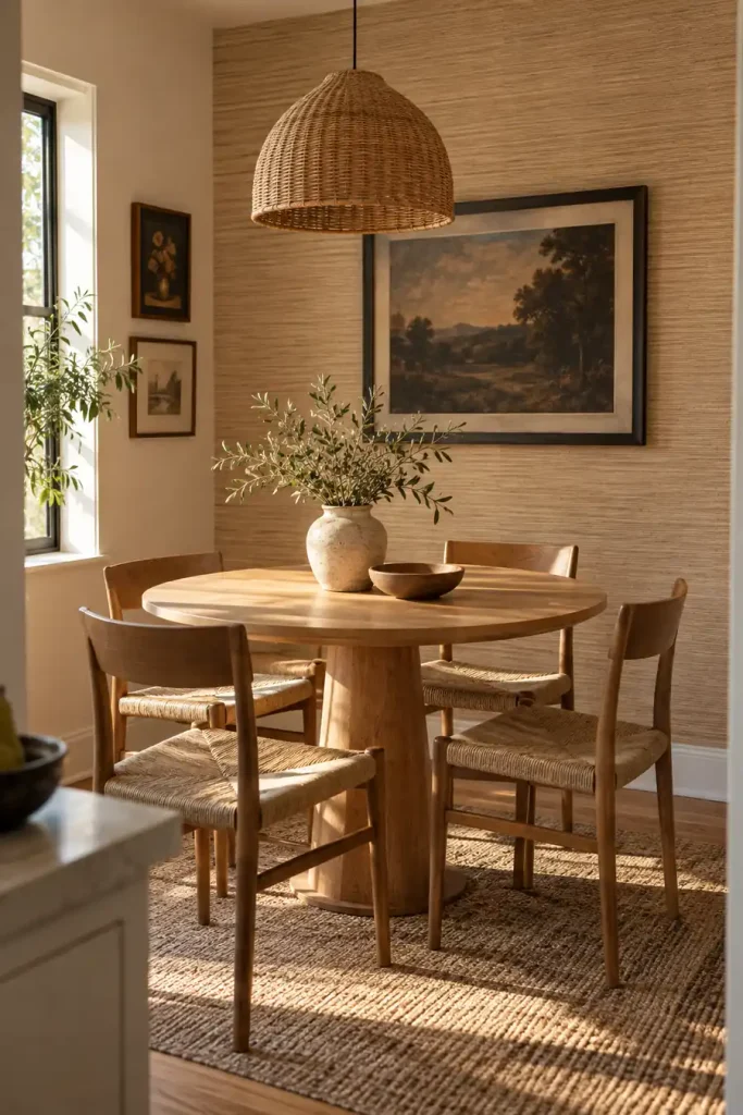
Real grasscloth has slight variation and visible fibers. A peel-and-stick version can borrow that look without trying to imitate every tiny strand.
Start with a warm neutral shade. Then build around it in three steps:
- Use the wallpaper on one dining or breakfast nook wall.
- Add wood furniture with a visible grain.
- Bring in one dark detail, such as black frames or a dark pendant, for contrast.
Avoid a pattern with a shiny finish if you want it to read as woven texture. A softer surface usually feels more believable.
Cover one defined wall instead of wrapping every surface.
Repeat the warmth with natural wood furniture.
Add one darker accent to stop the neutrals from looking flat.
8. Stretch a Narrow Hallway With Fine Vertical Stripes
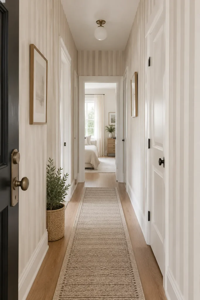
Thin stripes can give a hallway more rhythm without turning it into a statement room.
Use a low-contrast pairing such as cream with taupe, beige with soft brown, or warm white with muted gray. The pattern feels calmer when the lines are narrow and evenly spaced.
A good hallway combination includes:
- slim vertical stripes
- simple lighting
- very little wall art
- one runner with a quieter pattern
The repeated vertical lines naturally pull the eye upward. That helps a low ceiling feel a little less heavy.
9. Use a Plaster Look Instead of a Busy Print
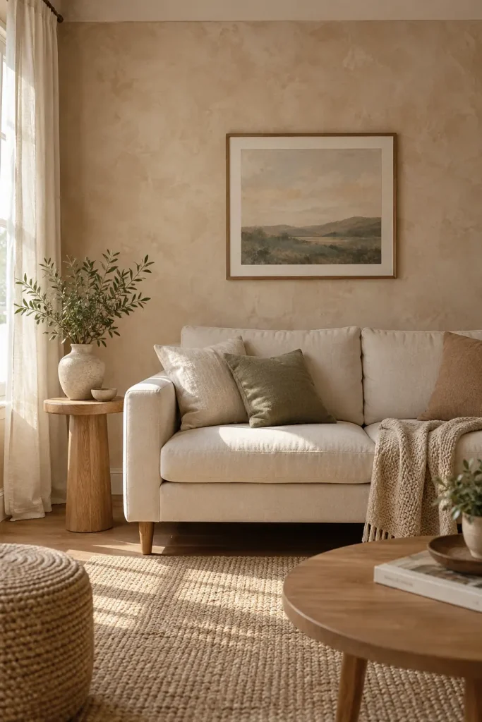
Some of the most convincing peel-and-stick walls do not look patterned at all.
A warm plaster or limewash inspired print adds variation without obvious flowers, grids, or motifs. It can work well for renters who want a little character but still prefer quiet rooms.
| Soft plaster look | Busy repeating print |
|---|---|
| Blends into the room | Becomes the main feature |
| Easier to pair with art | Needs simpler wall decor |
| Repeat is less noticeable | Repeat may be easier to spot |
Look for gentle tonal movement rather than dramatic dark patches.
| Soft Plaster Look | Busy Print |
|---|---|
| Feels like a wall finish. | Reads clearly as a pattern. |
| Works easily behind artwork. | Usually needs fewer competing details. |
10. Give a Home Office a Soft Checkerboard Wall
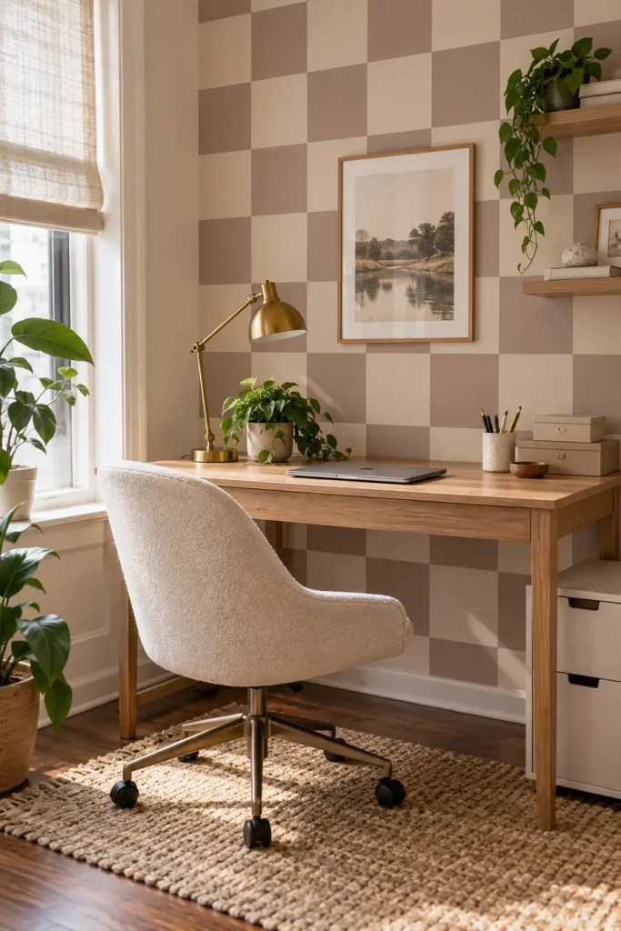
Checkerboard does not have to mean bold black and white squares.
A softer version in dusty brown, faded cream, sage, or muted blue can make a small work area feel designed without looking like a novelty pattern.
Keep the squares fairly large. Tiny checks can feel busy behind a computer screen.
A simple desk, one task lamp, and closed storage help the wall stay interesting without creating visual noise.
A familiar pattern in quieter colors feels playful enough for a workspace without overpowering the desk.
11. Try a Tiny Botanical Print in a Powder Room
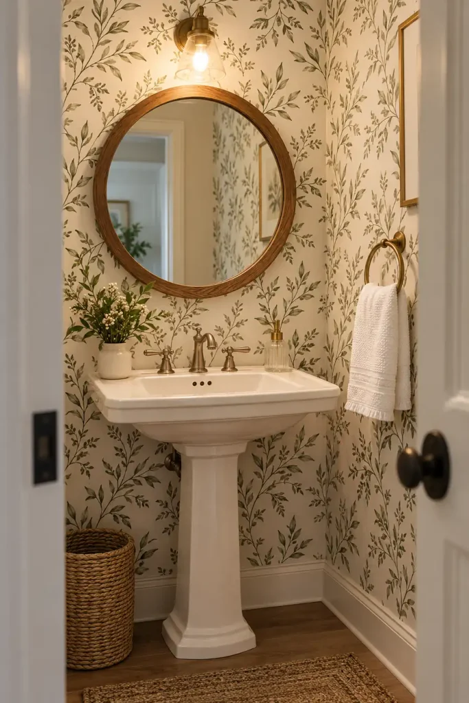
Small rooms can handle patterns that might feel too busy in a living room.
A tiny leaf, sprig, or hand drawn botanical print works especially well when the colors stay limited. Cream with olive, dusty green with white, or soft brown with beige can feel collected rather than themed.
Keep the plumbing fixtures and towels simple.
The wallpaper already brings detail, so extra signs, baskets, wall sayings, and decorative shelves are usually unnecessary.
A small repeat also makes pattern matching less visually dominant across a compact wall.
Keep the room balanced
12. Put the Pattern on the Ceiling
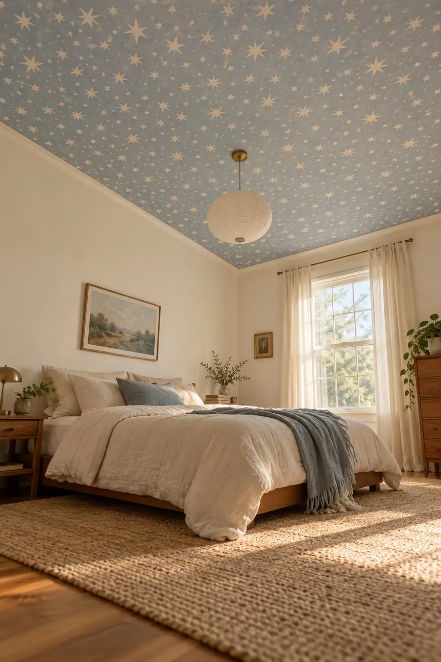
The ceiling is an unexpected place for removable wallpaper, which is exactly why the result can feel custom.
A bedroom or small office can handle a subtle ceiling pattern while the walls stay plain. Soft stars, tiny geometric marks, watercolor clouds, or a restrained repeating motif can work without pulling the room downward.
Use a lighter background if the ceiling already feels low.
Use a light background.
Keep the walls mostly quiet.
Very dark paper on a low ceiling.
Several competing patterns in the same room.
13. Line the Back of a Freestanding Bookcase
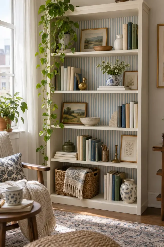
You do not need to cover an entire wall to make wallpaper part of the room.
A peel-and-stick pattern behind the shelves of a freestanding bookcase creates depth and makes ordinary storage feel more intentional. This works best with a restrained print that does not fight with the books and objects in front.
Good choices include:
▸ faded ticking stripes
▸ tiny floral patterns
▸ soft block prints
▸ quiet geometric motifs
Leave a little empty shelf space. If every inch is packed, the wallpaper disappears.
- ▸Use a low contrast pattern behind books.
- ▸Keep some open space so the background can show.
- ▸Repeat one wallpaper color in a nearby accessory.
14. Frame Wallpaper Panels Instead of Covering the Wall
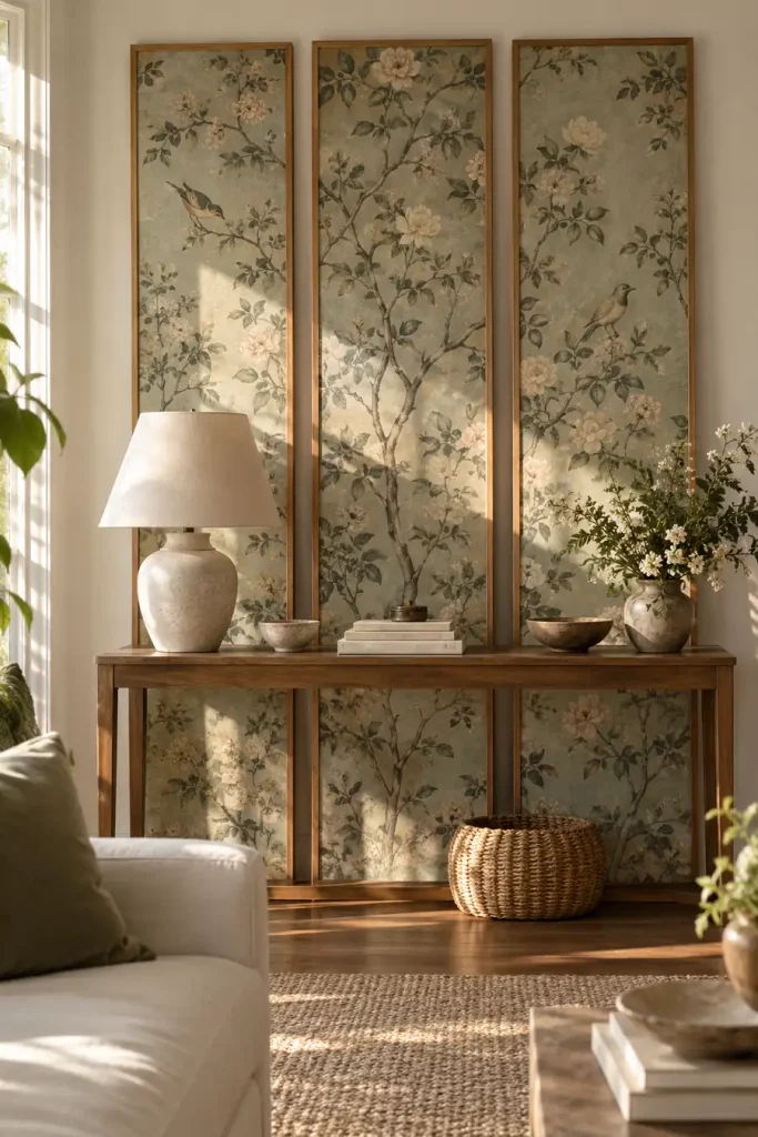
Large framed sections of wallpaper can give you the pattern without committing to a full installation.
Choose two or three matching panels, mount the wallpaper inside lightweight frames or removable display panels, and hang or lean them where appropriate.
This works especially well with scenic, floral, or block printed designs because each panel reads like artwork.
Pick a pattern with enough detail to stand alone.
Split the design into matching vertical sections.
Treat the finished panels like oversized art.
15. Make a Half Wall Feel Architectural
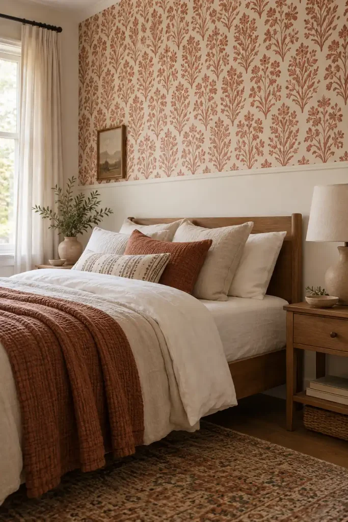
A half wall treatment can look more deliberate than covering the whole room.
Use wallpaper on either the upper or lower section, then create a clean horizontal stopping point. In a rental, that boundary can come from existing trim, a removable molding solution, or simply a carefully measured line.
A quiet stripe, plaid, floral, or block print works well because the smaller area keeps it from becoming overwhelming.
📌 Good To Know
The stopping line needs to look intentional. Measure from several points instead of assuming the floor or ceiling is perfectly level.
16. Use Vintage Toile With Modern Furniture
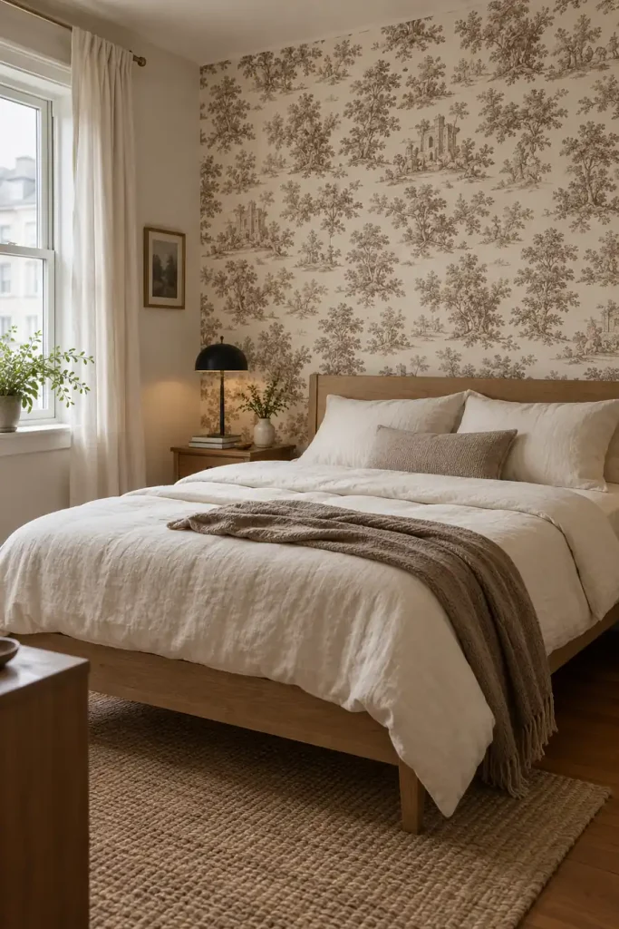
Toile can feel formal, but pairing it with cleaner furniture changes the mood.
Choose a two color print instead of a highly detailed multicolor version. Soft brown and cream, faded blue and white, or muted green and ivory are easier to live with.
Then bring in simple furniture with straight lines.
The contrast is the point: old fashioned pattern, modern shapes.
That mix helps the wallpaper feel collected over time rather than like a temporary decorating trick.
Traditional wallpaper with equally ornate furniture can make the room feel staged.
A classic toile print with simple furniture feels fresher and more believable.
17. Add a Faux Tile Pattern to a Laundry Nook
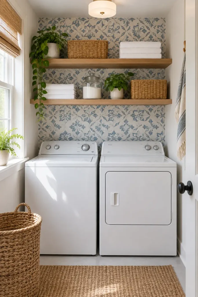
A compact laundry area can take a stronger pattern because you only see a small amount at once.
Look for a tile inspired design with a consistent repeat and restrained colors. Soft blue and white, warm clay and cream, or muted charcoal can bring life to the wall behind machines or open shelving.
Start with a clean visual boundary, such as the edge of cabinetry or the width of the laundry area.
Define the exact laundry zone before applying the pattern.
Keep baskets and containers mostly plain.
Check the product guidance for the surface and room conditions.
18. Use Oversized Arches for a Modern Bedroom Wall
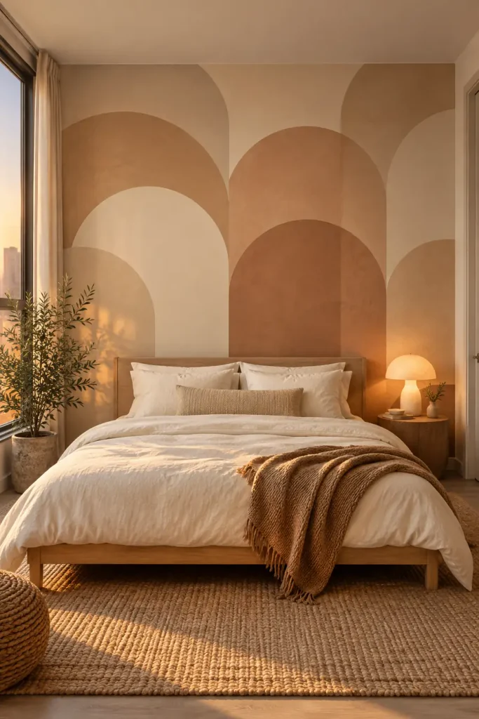
Curved shapes can soften a room filled with square furniture.
Choose a wallpaper with large overlapping arches in close colors such as sand, terracotta, cream, or muted brown. The bigger scale is important. Tiny arches can read as a novelty print, while larger forms feel more like a mural.
Use the wallpaper behind the bed and keep the headboard simple.
19. Create an Ombre Wall With Almost No Visible Repeat
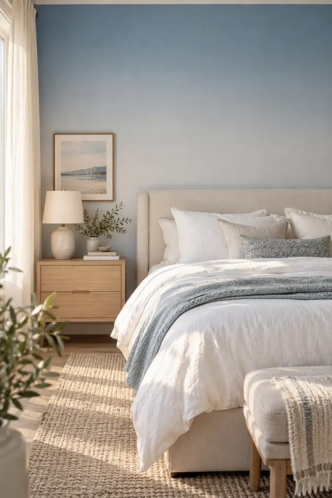
An ombre design is useful when you want color but do not want a pattern to announce itself.
A gentle fade from deeper color near the bottom into a lighter shade above can make the wall feel more like a painted finish.
Good combinations include:
- clay into cream
- dusty blue into pale gray
- sage into warm white
The fewer obvious landmarks in the design, the less attention your eye gives to panel joins.
| Ombre | Detailed Print |
|---|---|
| Reads more like a painted effect. | Reads clearly as wallpaper. |
| Pairs easily with artwork. | May compete with framed pieces. |
20. Use a Muted Plaid in a Reading Corner
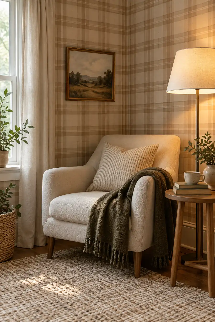
Plaid can feel surprisingly grown up when the colors stay soft.
Instead of a bright tartan, look for a loose grid in camel, cream, faded olive, or dusty brown. Use it in a small reading corner where the pattern can create a sense of enclosure.
A plain chair, one floor lamp, and a small side table are enough.
A quiet plaid gives a small corner definition without needing extra shelves, signs, or decorative clutter.
21. Let a Tonal Block Print Carry the Whole Room
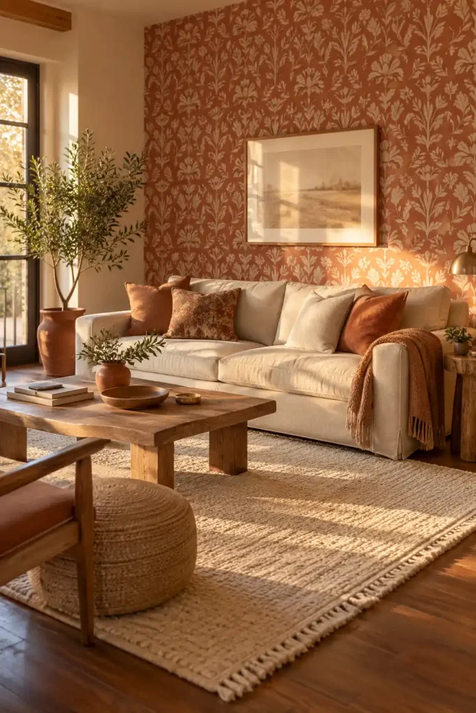
The easiest way to make a patterned wall feel expensive is often to reduce the number of colors.
A hand printed style motif in two close shades, such as rust and clay, navy and faded blue, or olive and sage, has enough variation to feel interesting without shouting across the room.
Use it on one clear wall and repeat one of its colors somewhere else in the room.
That might be a throw blanket, lamp base, pillow, or small rug.
The repetition ties the wallpaper into the room instead of making it look pasted on afterward.
Pull the room together
Good removable wallpaper should feel like part of the room, not something added at the last minute. Start with the space that bothers you most, then choose a pattern that suits its size, light, furniture, and purpose.
Some of the strongest peel-and-stick wallpaper ideas for renters are surprisingly simple: one textured bedroom wall, a small patterned nook, a quiet mural, or wallpaper used inside furniture instead of across an entire room.
Before covering a large surface, check the product instructions and test a small hidden area when appropriate. Then let the rest of the room stay simple enough for the wallpaper to do its job.
Save the ideas that fit your rental to Pinterest so you have them ready when it is time to tackle your next blank wall.